
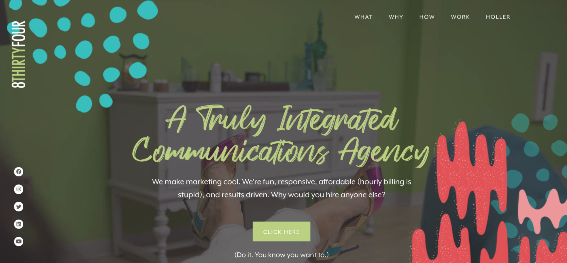
We’ve told our clients their online presence needs to represent their brand fully. There’s no point to having great sales decks and print material or, really, even a kickass social media presence if your website looks like it’s from 1992. We decided to take our own advice and create what is now, according to us, the coolest agency website.
We’re super proud of the results, check out how we do what we do.
Task
We had already rebranded 834 design to 8THIRTYFOUR a few years ago, but it took us a bit to update the URL to our site (those of you who were around then, thanks for sticking with us). When we finally did, we thought, “Hey…we should probably make this whole thing more us.”
Here’s the thing, though. Just like with self care (yes, we know Kim hates this word, but we’re adding it here anyway), it’s way easier to take care of clients than it is to focus on your own brand…even when that’s what brings clients in. So, when we finally decided we’d had enough of the old and needed some new, we cracked our knuckles, poured ourselves some wine, and got to work.
Goal
This time around, we weren’t exactly starting from nothing. Instead, we had an old site with a lot of pages we didn’t need, along with photos that were outdated and branding that didn’t really wow us. Hell, the windows we had as the hero image on a bunch of our pages had broken years ago…and yet there they were, immortalized on the site.
Still, we couldn’t just focus on the design. We needed a site that would look and function how a newly reworked site should. To do that, the site needed to include:
- Blogging functionality
- HubSpot integration
- Forms for lead capture
- The newest version of WordPress
- An easy, user-friendly drag-and-drop interface (please and thank you)
- Google Analytics and Facebook Pixel integration
- SEO tools and optimization
- A brand-new content library, featuring videos and our Happy Hour Hustle podcast
- A portfolio for all of our case studies (like this one)
- A live Instagram feed
- Job listings
- Approximately a million more photos of the dogs
- Features for every team member
- Landing pages for individual campaigns
- The ability to utilize gifs as featured images
- A mobile-first website design
- And a whole, whole lot more
If that sounds like a lot, it’s because it is. That’s because when we started thinking about what we wanted out of our site, we approached it with a “the sky’s the limit” attitude. And we’re sure glad we did.
Results
Hold on. Let us catch our breath.
Okay. After all of that, we wound up with what we can only describe as a kickass site. Don’t believe us? Check out these before and afters:
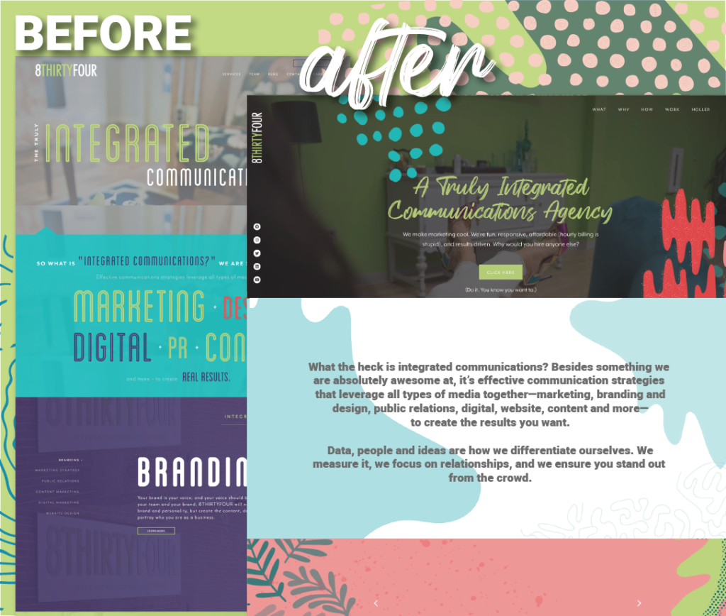
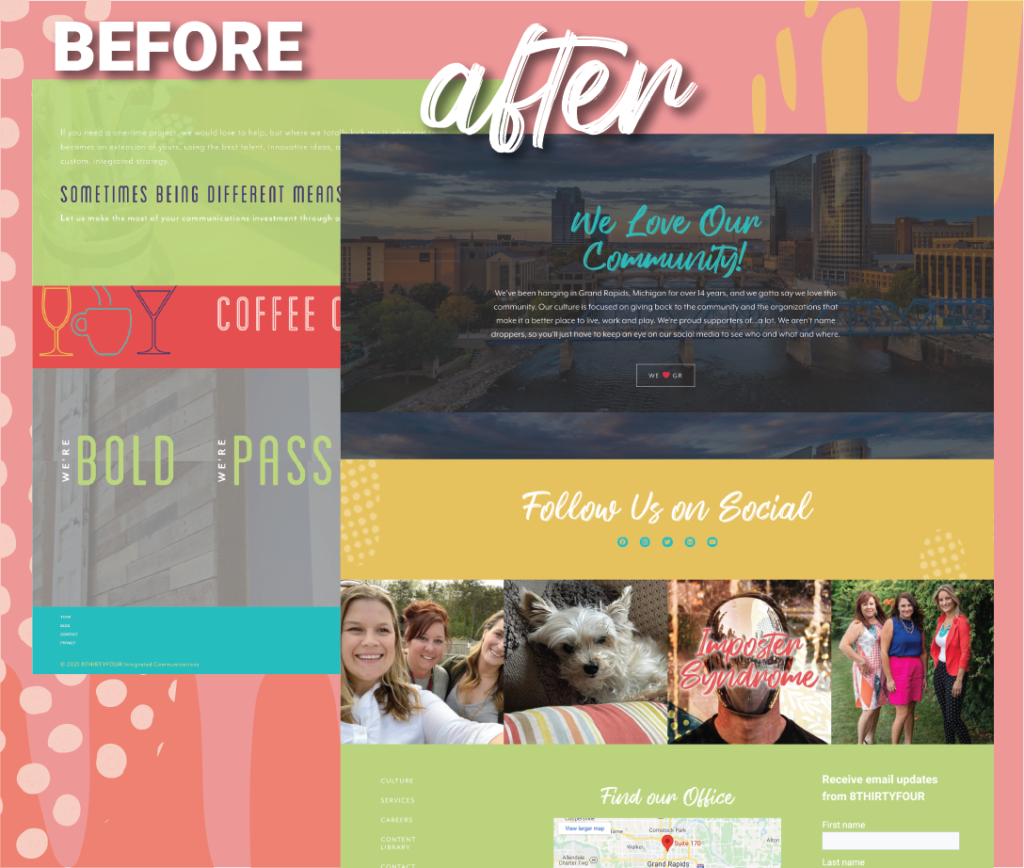
Not too shabby, huh? We’re pretty damn proud of how it all turned out. Being able to subject ourselves to our own website process helped us identify areas we could improve upon for our clients…and we did just that! Now we’ve got the site of our dreams, and we even walked away with a few improved processes. We don’t know about you, but we’d say all that hard work was worth it!
Blog Conclusion
We always love bringing clients’ website dreams to life. If your site is in desperate need of a little TLC, reach out to us. We’d love to whip you up something amazing.


Responses