
‘Less is more’ is a little cliché, but for the sake of argument, we aren’t going to reinvent the wheel. It’s a concept that applies to a lot of different things: storage solutions, toilet paper, fonts, etc. The world would be a much more beautiful place if designers used this concept as a golden rule for creating anything that could or would be seen by the general public. If this were true, we would never again get that terrible feeling when picking up a menu, hoping your food wont be as sloppy as the cluttered chaos of poorly aligned type. Or driving by a billboard with so much copy, you put yourself at risk of driving right off the road and still have no idea what it was for. ‘Less is more’ is a magical little rule that can take even the most hideous branding and avoid the headache of clutter, confusion and disinterest.
Every project is different, but when it comes to copy, get right to the point. In the same way that people dislike reading long, drawn out emails, they also dislike, for example, having to scour an event poster to find simple information like the date, time, etc. We aren’t always patient and our lives run so fast that we aren’t going to slow down for something that doesn’t immediately answer our initial questions. What does the audience absolutely need to know? What will their first questions or reactions be? Whatever those answers are, focus on those as a starting point.
Additionally, focus on simplicity with your branding elements. Your visual brand is created for a reason, and that is to set a standard for visually communicating your message to your audience. Your visual elements are what keep all brand collateral, marketing and advertising campaign material consistent, even before the viewer is able to read and understand your messaging. Think about how long your particular project will be in front of the viewer. For example, when walking down the snack bar aisle at a grocery store, a product has less than a few seconds to grab your attention. To engage your audience, your product needs to be deliberately reflective of your brand, and not lost among the crowd of other colors, shapes and sizes. Designers, stop adding in visual fluff for the sake of visual fluff. Don’t get carried away. If it doesn’t aid in communication, don’t add it to your design.
Now that we’ve removed all the clutter, our design has some actual room to breathe. USE YOUR WHITE SPACE, PEOPLE…USE IT! This provides a nice little break for the eyes of your viewer and gives you as the designer the upper hand in guiding your audience through the information. The hierarchy of your information, meaning how you lay out each piece (more important elements holding more visual weight than less important elements), is also much more manageable when your design components aren’t fighting for space amongst themselves. Going back to your event poster, whether your most critical information is the title, date, time, location, or speaker, you now have control of what the viewer sees first, what they see next and so on. Thus, creating deliberate communication of each piece of information, with minimal confusion, frustration, and chaos. Now everyone, including you, is much happier, because your work has been received in a pleasant, effective manner.
Of course, there are many other ways to combat the disinterest of your audience, but concise copy, consistent branding, and deliberate delivery of information apply to every project you tackle. Don’t get lost in the crowd (or in your own head), design needs to be strategic, simple, and intentional; this will always help in avoiding the wrong visual direction.

The power of the Women`s Entrepreneurial Fellowship, in a graduate`s own words:
"Growth is never accidental, it comes from being willing to learn, adapt, and embrace change. After nine months of dedication, reflection, and business development, I proudly graduated from the Women`s Entrepreneurial Fellowship (WEF) during the Small Business Association of Michigan Annual Meeting.
Throughout the program, I challenged myself to evaluate every aspect of my business, celebrating what was working while identifying opportunities for growth and improvement. The journey was made even more meaningful through the support of an incredible cohort of women entrepreneurs, the guidance of mentor Gina Jacquart Thorsen, and the leadership of bodespeaks and her team.
A sincere thank you to smallbusinessassocofmichigan for investing in second-stage women business owners and creating opportunities that empower entrepreneurs to build stronger, more sustainable businesses."
— Mary A. Barton, President and CEO of Equitable Accounting Solutions and proud WEF graduate.
Applications for the next cohort are now open. Link in comments.

"Out of failure comes growth – you have to see it as an opportunity."
bodespeaks joined cuzzinjustin on the strictlyfromnowhere Podcast for an honest conversation about entrepreneurship, embracing your superpowers, and building a personal brand that`s actually yours, the wins, the setbacks, and everything in between. And naturally, dropped an f-bomb or two along the way. You don`t want to miss it.
Full episode in the comments 👇
AI doesn`t treat every source equally; it trusts what`s credible, cited, and current, like news coverage.
Showing up in the right places isn`t just good PR. It`s how the robots (and the humans) get you right.
Read the full blog at the link in bio.
"If you don`t get up and grind every day, the needle isn`t gonna move."
We sat down with brandonmccraney, founder and Master Blender behind olderaleighdistillery in Zebulon, North Carolina. Brandon spent fifteen years just thinking about whiskey before he finally opened his doors, and even then it took four more years, a dozen rejections, construction delays, and a global pandemic to get there. Two years later, Olde Raleigh had already won Best Micro Distillery in the US.
Check out the latest episode of Happy Hour Hustle, where Brandon shares what it actually took to grow a business through COVID, the military discipline that kept him going when everything else said quit, and how working with people turned out to be the hardest part of the job.
Listen to Happy Hour Hustle on Spotify, Apple Podcasts, and watch the whole episode on Youtube. Link in bio.
It`s 9 months that is impossible to sum up in a video - but here`s just a taste.
This Women`s Entrepreneurial Fellowship is resources, mentorship, and connections that you can`t build anywhere else. We`re so exicted for what the next cohort will bring.
Apply now at the link in bio.
smallbusinessassocofmichigan
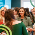
Another cohort of the Women`s Entrepreneurial Fellowship just graduated, and honestly, the numbers only tell half the story.
The real value comes from the friendships, the business (and life) changing advice, and the community that shows up long after the program ends.
As one fellow said: "The other women in that room are not your competition. They are your curriculum."
Congrats to this incredible group.
Read the latest program blog at the link in bio.


Responses