KNX Utility Services first came to us without any sort of logo or branding at all. Immediately, we knew we needed to do something. 77% of B2B marketers agree that branding is super important for company growth, so we knew we had to get to work right away. Make sure to read the whole case study. The results are…shocking (we couldn’t resist).
Our Task
KNX Utility Services is a transmission and distribution electrical contractor that puts safety and reliability at the forefront of their work. Their team is pretty badass and we’ve had the pleasure of working with them on several other projects, they just keep coming back for more. Must be our charming personality.
Our team was tasked with developing a new logo, color palette, and a comprehensive brand guide for KNX. Since your logo is one of the most important things about your brand, we were excited to start with a clean slate for them. Like…how often do you get that opportunity? Almost never.
Goal
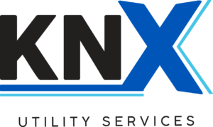
A simple logo that represented their focus on safety, reliability, trustworthiness, and expertise. They loved the idea of the logo including the colors blue and black, since the color scheme represents the way they support their customers in blue or stormy skies. We also recommended a logo design that was simple yet bold and recognizable. We wanted to create a logo that could include “KNX Utility Services” or also stand alone as “KNX.”
Process
Our branding process is a ton of fun. We followed these steps to set KNX up with an awesome logo:
- First, we met with KNX to chat through their initial thoughts about how they view their current brand.
- We sent out a questionnaire for the client to fill out about what they wanted in a logo.
- We researched competitor and industry logos (a lot of them were really boring).
- Our creative team drafted up lots of logos.
- We held an internal battle royale to pick our favorites.
- We presented the top three logo options and two color palettes to our client.
- From there, we went back and forth with KNX until they were happy.
- We created the stunning and beautiful logo below!
Check it out in all its glory.
Results
Okay, it sounds cliche, but for real. When our client is happy, that’s when we know we did a good job.

In this case, KNX was super happy with the way we portrayed their company. The color palette and boldness of KNX is modern, clean, and recognizable. They are easily able to use just the “KNX” by itself or with the full logo. We also made them a comprehensive brand guide outlining logo treatments, font usage, and color details. What we’re saying is this was a huge win.
Whether you have a blank slate or a need to refresh on your current logo, we’re here to help! Our first priority is making your vision come to life. We’ll guide you with our industry knowledge and experience until you have the logo of your dreams! Let’s get in touch.


