For today’s class, we’re going to be talking Typography. Typography is the differences between various styles of text that create distinct appearances. For instance, one popular typeface in the Middle Ages was blackletter, which was used to print many publications, including the Gutenberg Bible.
Graphic Designers all over the world spend more time sweating over what font to use than color palettes, composition, shapes, texture, space…you get the drift. They want to choose the font that best suits the the usage—it’s a vital component of user interface design. There are over 200,000 fonts that exist in the world today. That’s not including all the fonts designers create.
Clear, Uniform and Efficient
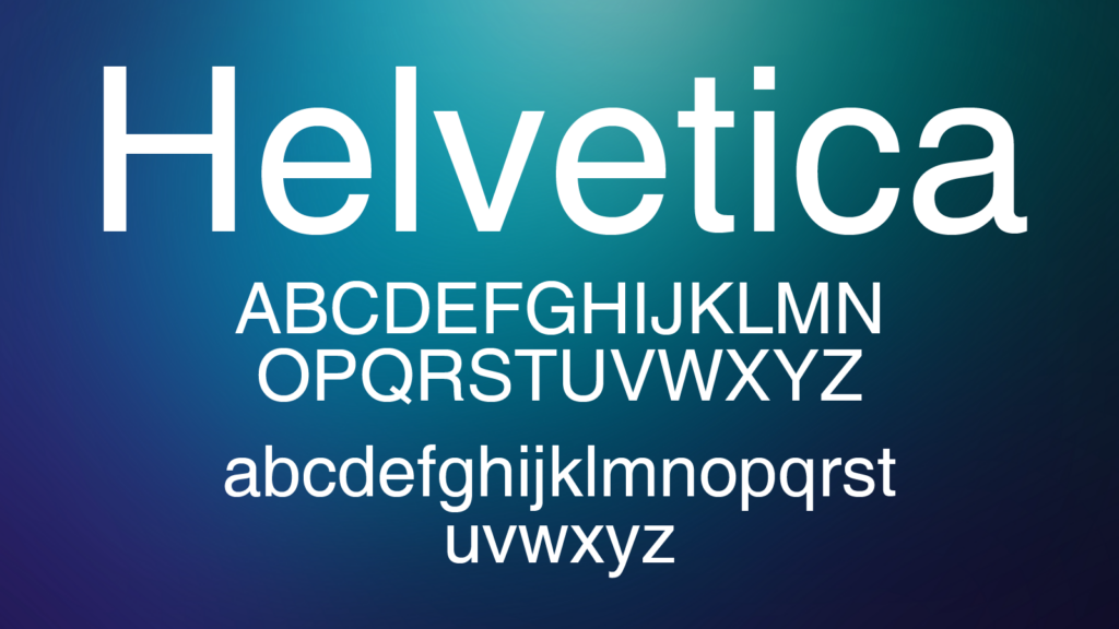
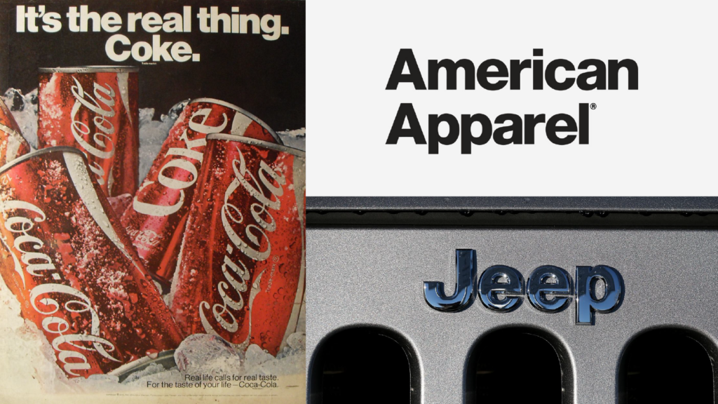
With so many fonts to choose from. How does one choose a font? Let’s look at the one most loved and appreciated by the design community. Helvetica. Why is Helvetica so popular? It is undoubtedly one of the most famous and used typefaces in the world. Helvetica’s clean lines, no-nonsense shapes, and simple efficiency is compatible with any kind of content and doesn’t detract from the design. Since the 1950s, designers have been choosing Helvetica, because it is assumed to be a “neutral” design. Over 40 companies are using the font because of its clarity and uniformed lettering.
Other fonts like Garamond, Futura, Bodoni, and Arial share some of the same attributes with Helvetica and have simple and uniformed lettering. But with all the love Helvetica gets, there is also a lot of hate. Most people think it’s way overused. Some people think that it is awful for readability and legibility for people with weak eyesight.
According to Design&Paper Helvetica’s success is often granted for the same characteristics it is criticized for – its unique tight spacing and dense and bold appearance
Whether you know it or not, you’ve seen this typeface everywhere…BMW, General Motors, Apple, Microsoft, not to mention the U.S. government (stop signs, anyone?), Canadien government, European Union…they’ve all adapted the font into their brand or reach in some capacity.
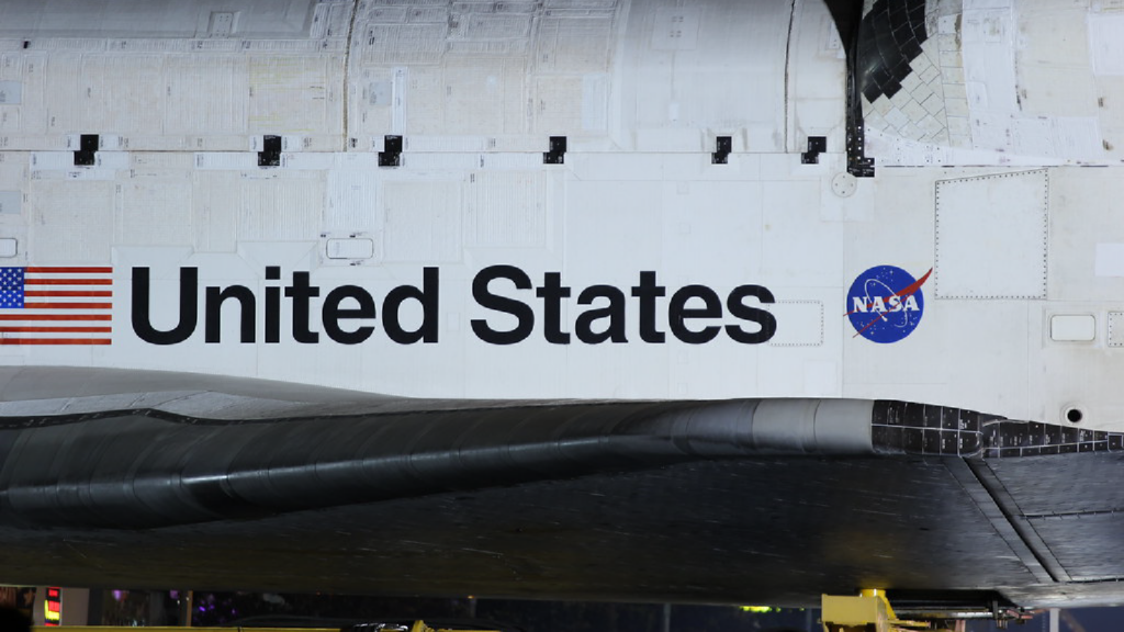
For all the haters out there, we have one word for you: NASA. NASA has been using the typeface extensively for decades. From shuttle signage to printouts to the freaking SPACE SHUTTLES, they plaster it everywhere. NASA believes the font to be one of the world’s most universal typefaces. 18,000 NASA employees can’t be wrong, they invented Tang for crying out loud. The same people that hate Helvetica think Papyrus or Comic Sans are great fonts. To that we say, enough said.
Not even Avatar could save Papyrus.

