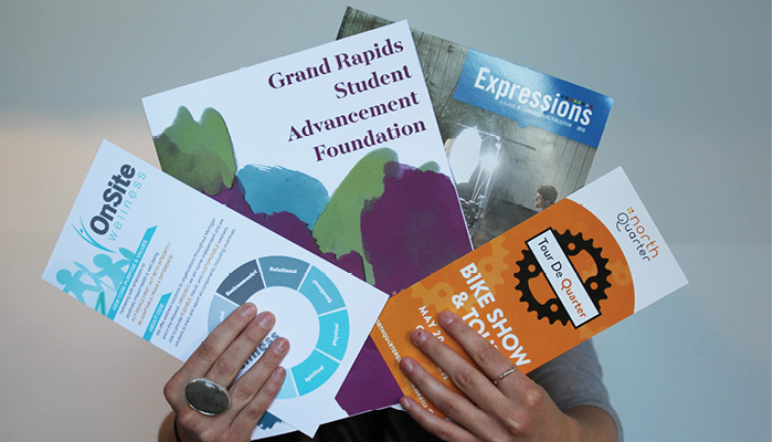
Print is by no means, dead.
Print, unlike any other form of branding material offers a tactile, engaging display of your brand, that if presented to the right audience, creates a powerful connection. Print media offers longevity that many digital channels do not. Print provides an experience that is more than seeing, feeling, moving, and folding. It provides physical interaction.
When we create print materials, we don’t just create the design as if it will eventually be ink on paper. We deliberately choose everything from the paper, its material, size, shape, texture, colors, folds, etc. to build an experience that goes beyond looking at a display of words and elements.
Years ago when the digital world was introduced, the use of printed materials for marketing collateral was forgotten about in the shadow of its shiny, new digital counterpart. Because many brands are heavily focused in the digital realm, having print materials does has an advantage.
Keep in mind: millennials engage and appreciate print more than other past generations. (According to Forbes, by 2020 millennials will make up 1/3 of the American adult population. If you aren’t targeting millennials, you should be. Take a look at this for a few tips on how to understand the millennial mind.)
The whole experience of a printed piece calls for a lot of strategic planning. The behind-the-scenes work that goes into print pieces are deliberate and well thought out and time consuming. First, you start with your overall branding, communication, and marketing goals, and work with each of these pieces to accurately reflect and reinforce your goals.
Once you understand what role your printed items play in accomplishing your overall goals, you can move onto the specifics:
Function
What is the function of your piece? Is it meant to be held, displayed, or moved? Is it informational or is it meant to reinforce your brand identity? Function is an important first step because this will directly impact your physical form (see the following sections for details).
Paper choice
Paper or other material choice is a great way to communicate the personality of your piece. Different textures, finishes, weights, and colors all evoke different feelings and experiences. A matte finish with the use of clean, high contrast elements communicates a modern, sophisticated message. A very exaggerated texture with bright colors and bold fonts might be used to imply a more youthful look and feel.
Finished Size & Folds
The size of your piece greatly impacts the way it is interacted with. Something large may be eye catching, but something small enough to hold in your hands allows for a more personal and intimate experience. Similarly, using folds as a way to organize how the viewer navigates through the piece is an effective way to enhance the viewers experience and make a stronger connection with the print material.
Printing Process
Your printer can help you with this part, but the type of printing process you choose presents different options and restrictions. Be sure you are able to communicate the end result you are looking for to your printer as clearly as possible. By doing so, the printer can guide you through the best processes (as well as you’re timeline and deadline for the piece –very important).
If you’re on a budget and have some flexibility within your timeline, this is always a good place to start. Before you get ahead of yourself, with a fancy origami, 10-fold, double sided, soft touch finish infographic, talk to you printer first. Don’t pour your heart and soul into something before knowing the reality of the situation.
Formatting, Coordination, Deadlines
Formatting your files for print, coordinating your needs with a printer, and knowing your deadlines might not directly effect the experience of your end result, but we are all still professionals with budgets, deadlines, and other projects. Work the logistics out ahead of time with your team, clients, and printer to avoid stress later on.
Keep in mind that every project and brand is different, but can be enhanced and reinforced through printing collateral. Utilize the tips and highlights above to plan your next branded collateral piece. Visit #team834’s blog for more information about branding, imagery, color choices, and more to help you create effective and strategic materials that captivate and engage your audience.