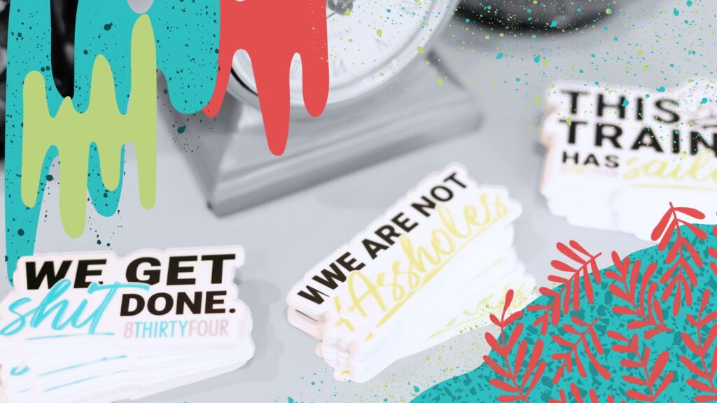
Your favorite color is yellow? That’s great, but I don’t care.
As the creative you’ve hired to develop a compelling and effective brand identity, it’s my job to advise you on the colors, font choice, imagery and design aesthetic that is most appropriate for your company. The goal in any branding or rebranding effort is to successfully connect with your audience – because at the end of the day, it’s about the traffic you drive, the awareness you build and the revenue you increase. Of course, your identity should be something you feel comfortable with, but this does not mean that your personal style should be a reflection of your brand. (Hence, why I don’t care that your favorite color is yellow.)
At 834, we research and evaluate your brand’s ‘who’ and ‘why.’ We thoroughly research your desired market before we establish your brand’s overall direction. Every minute detail that goes into creating your visual brand needs to be a deliberate and well thought out component of the bigger picture. There are many factors to consider when creating your brand identity… So, lets dive right in:
Brand Personality
Your brand’s vibe and attitude are very easily communicated through messaging, language and tone of voice, but how is this communicated through visuals? Culturally, different colors, hues, and palettes evoke different emotions and connotations. For example, if your messaging and language communicates a relaxed tone of voice, then yellow (although, it is your favorite color) will not cohesively apply to your brand’s identity. In general, warm tones are associated with passion, energy and boldness. Whereas, cool tones are associated with calmness and balance. Your brand’s visual identity is the first thing your audience sees, even before your message and service/product details. It is extremely important that your brand’s visual identity be clear and cohesive for this reason.
Target Audience
It is imperative that your brand reflects the values, needs, and preferences of your target audience. (Keep in mind that you may not fit within the target audience of your demographic, and that is ok, but this disconnect must be acknowledged.)
When it comes to your brand’s design style and imagery you have to stay within certain parameters to create something that resonates with your target audience. If your audience is mainly moms between the ages of 30 – 40 years old, then your imagery should resonate with the values, needs and wants that apply to this demographic. Likewise, if your audience is millennials between the ages of 18 – 30 years old who enjoy art, then your imagery should resonate with this. Show your audience that you’ve done your research and you understand them.
Functionality
Implementation plays a large roll in how an identity is developed throughout the design process, beginning with rough sketch concepts and ending with a finalized thorough identity. The implementation of your brand’s identity and functionality across multiple mediums must be considered before deciding your brand’s design direction. These mediums include: signage, apparel, promotional items, and more.
Another functionality issue that we must consider is how your bran’d design interacts with surrounding space. This particularly applies to products are in close proximity to its competitors, such as by sitting on store shelves. You must stand out without losing your own identity. Deciding how your brand will function beyond its own working parts is imperative to the success of your brand’s design identity.
No matter what your personal preferences may be, you must remove yourself from the equation for the sake of your brand. Considering your brand’s personality, target audience, and functionality needs outweighs personal preference. This thought process will allow you, as an entrepreneur or business owner, to make strategic decisions regarding your brand’s design identity.
(P.S. – I don’t have anything against the color yellow.)


