June 21 has come and gone, officially welcoming Summer 2015 to West Michigan. A season punctuated by bright, vibrant, crazy colors reminiscent of our fearless leader’s wardrobe, we chose to celebrate the passing of rain clouds and grey skies by pulling some of our favorite summer shades for head-to-toe, inside or outside, garden to garage inspiration. And because no blog is truly complete without a musical introduction, we’ll let the Spice Girls lead you in.
Beach Day
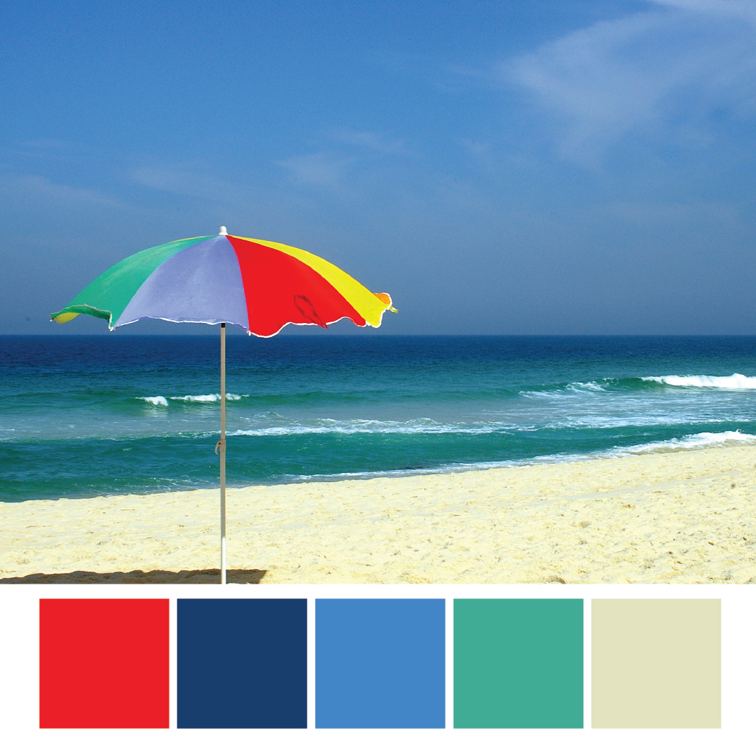
Living in a state that’s 41.5% water means beaches, beaches and more beaches. Keep your eye on the weather channel, switch out your snow boots for sandals and dig your swimsuit out from wherever it’s been hiding since September. With a classic range of summer colors, this palette boasts the blues of Michigan’s lakes. Warm accents intermingle with splashes of color from umbrellas dotting the coastline, usually to shade the eager sunbather painfully rocking a shade of red from the day before. Save your skin this season with an SPF larger than eight, dammit!
Where to Use It: These bright colors scream sounds of the season and are perfect to use for any summer design. With a strong base of primary colors, this scheme works well for a younger audience. Use a base of blue and blue-green to create a bright and youthful design for your next summer event.
Try This: Use the tan as a background color to soften the contrast and create a more reserved design.
 Nautical Nation
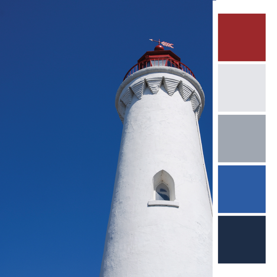
With all of our Michigan water and sandy beaches, there’s a need for many Michigan lighthouses (247 to be exact).
Where to Use It: This nautical color scheme is unmistakably a beach house must. Decorate your house with these colors or use it for your next boat outing invite. Either way, be sure to include an anchor for the perfect preppy accent.
Try This: Challenge yourself by only using shades of blue in your next summer design. Use white as a break in your design and red to accent the important information. Need a calmer or more sophisticated design? Try using shades of cool grey or white as the base of your design with accents of blue to add excitement and color.
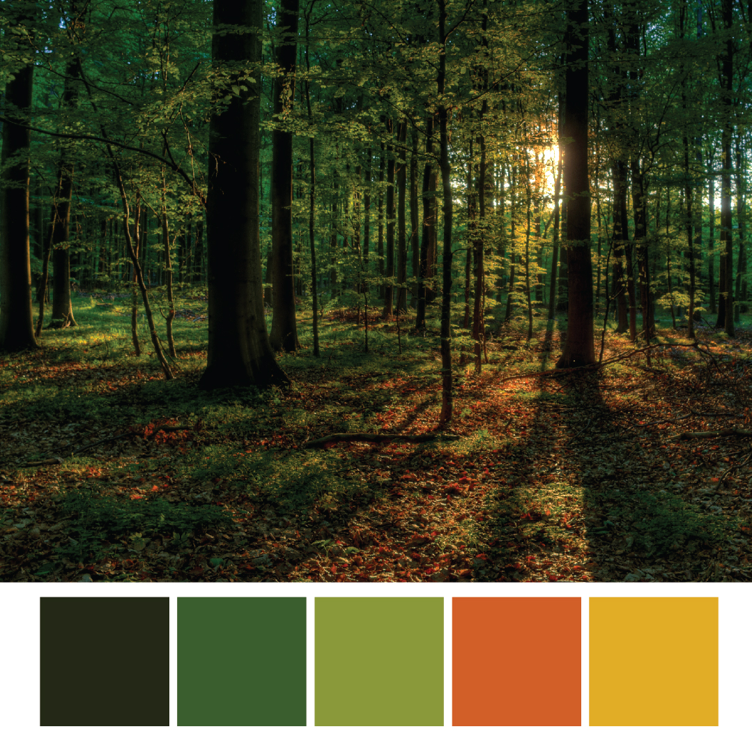
Summer Greens
Heading away from the lake color scheme and into the surrounding forests, these vibrant hues of classic fall colors are a perfect representation of your weekend escape into Michigan’s wilderness for camping or a hiking exploration. If you take a drive up to Northern Michigan, you’ll know why we incorporated lush greens into our summer palette.
Where to Use It: Coming straight from the roots of the inspiration, use this color scheme on summer event invites that include camping, woodsy/nature or even sporting events: a mud run, for example.
Try This: Add more yellow to draw this color scheme out of the woods and into your next design.
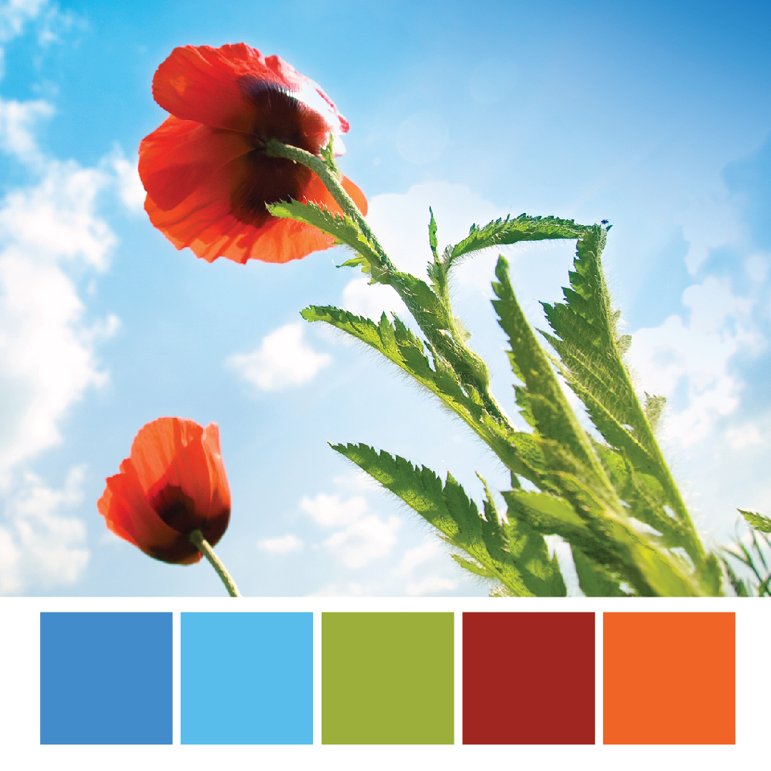
Summer Has Sprung
The beginning of summer means wildflowers sprouting, hydrangeas blooming, poppies peaking and roses blossoming. Gardens are bursting at the seams!
Where to Use It: With a balance of blues and reds, this color palette has a wide range of midtone colors. Use this color scheme to represent anything from a farmer’s market to your next summer barbecue.
Try This: Be careful not to overload your design with equal amounts of each color. Choose one hue as your base and use the remaining colors as accents or callouts.

Sun
This color scheme draws inspiration from the queen of summer herself: Little Miss Sunflower.
Where to Use It: This bright color scheme is a great start for your next summertime picnic. Break out the sunflowers, dust off the grill and pour a glass of lemon water to enjoy a refreshing summer day.
Try This: Match the intensity of this pallet with a lime green to create a vintage or retro design for your next summer soiree or blues to transition it into a beach-/sky-inspired palette.

From Invisible to Unforgettable: Why Your Personal Brand is Your Superpower
In a world drowning in noise and a lot of BS, how do you stand out? How do you become the Purple Cow? The answer

