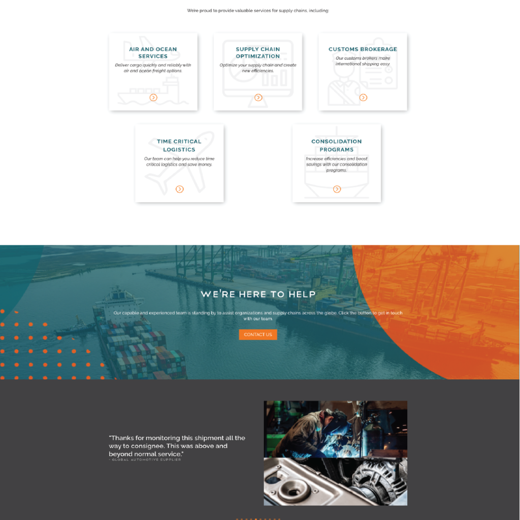
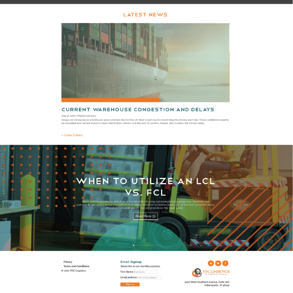
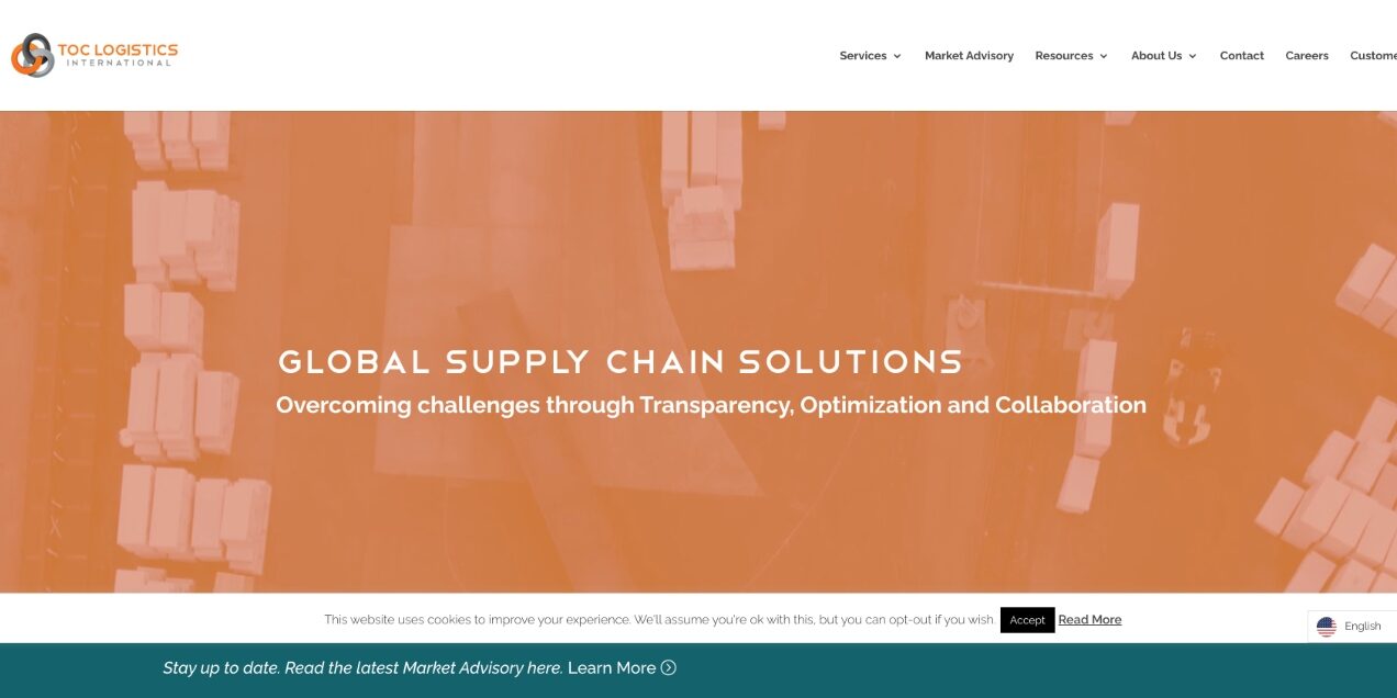
TOC Logistics International is one of those clients who has a super special place in our hearts. Maybe that’s because we’ve been working with them for almost a decade, or maybe it’s because they never fail to make us laugh. Their sarcasm rivals our own.
We created TOC’s first website about a gazillion years ago and it was definitely time for an update…for our own sanity. Websites need to evolve, integrate new technology and change with users. It’s all about user experience and mobile friendliness.
Task
TOC’s old site was effective, but it wasn’t necessarily a good representation of the brand in terms of colors, imagery, or even voice. TOC’s fun and easy to talk to, but the old site was hard to navigate and clunky. We set out to make something sleek, accessible, and efficient.
Goal
Like every website, TOC’s new site had to do more than just look good. We needed to create a site that included:

- Updated brand colors
- Fresh, approachable content
- Mobile-responsive design
- User-friendly interface
- Forms designed for specific types of lead capture
- Pages for each of TOC’s extensive and complex services
- A blog that could accommodate new designs and blogs going back to 2013
- A section of the site for pressing Market Updates
- The ability to change site language
- The ability to make pages for various campaigns and integrations as needed
- The newest version of WordPress
- A user-friendly drag-and-drop interface (the old site was built on shortcode…ew.)
- Google Analytics integration
- SEO tools and optimization
- reCAPTCHA v3 integration (see ya, spam bots)
The best thing about TOC is that they know what they want. That made working on this site a fun challenge, since it was clear what was and wasn’t important to TOC’s as well as in the industry as a whole.

Process
This project was intended to be quick and efficient. However, while we were working on the website, COVID-19 hit. While that didn’t impact 8THIRTYFOUR’s timeline much, it did do a number on the supply chains of the world. Since TOC is a logistics and supply chain management company, it was essential that they focus on making sure their customers’ cargo got where it needed to be.
Due to this, the site got put on hold for a bit, only to be fired back up once the industry was (a little) more stable. Once we could all work together again, our teams tackled the following:
- Website strategy meeting
- Site map and strategy development
- Keyword research
- Site development with a drag-and-drop editor
- Content creation
- Content edits
- Google Analytics, SEO integration, alt text, metadata, and the works
- WeGlot integration
- Some cool Spanish content edits from the TOC team
- QA
- Client QA
- A few more QA edits
- Site launch
- Post-launch QA
- SEO follow up with Google Search Console
Results
It took a lot of organizing, designing, and testing, but the new site went live without a hitch! We’re huge fans of the redesign. Go ahead. Click around, and check out all of the awesome new pages. We’re pretty confident on calling this one a glow-up.
Conclusion
Struggling with a site that hasn’t matured with your brand? Uh…get in touch already! We can bring that tired old site into the current millennium.


