
That’s right! It’s time for another spring color palette blog! We know you guys love these, and honestly? We do, too.
Since things are a little weird and dreary right now, we figured we’d brighten your day with some beautiful color palettes from our graphic design team. Without further ado, here are our badass spring 2020 color palettes.
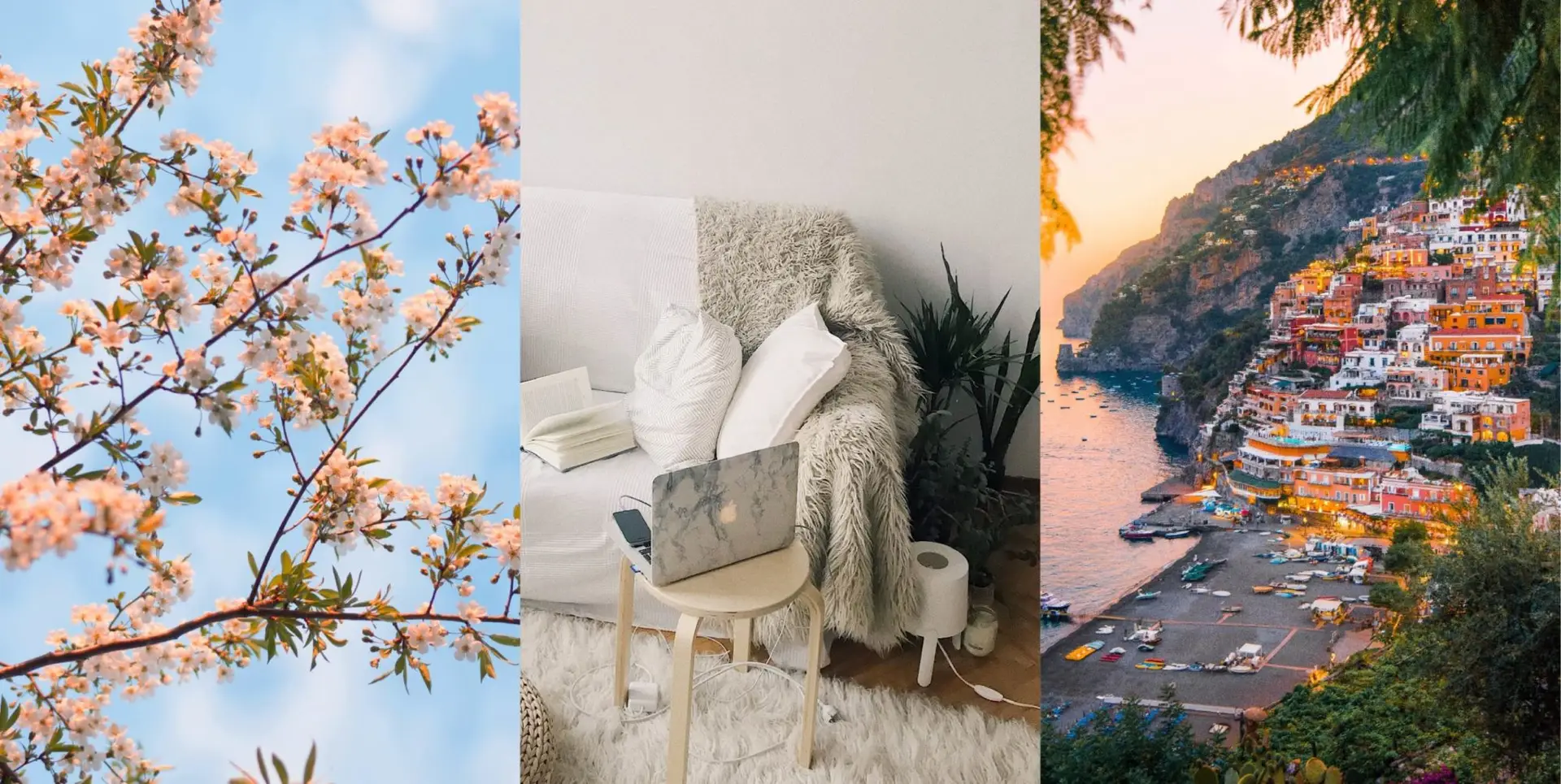
Fresh Air
Nothing says spring like the outdoors. Seriously. If you haven’t gone for a (socially distanced) walk, you’re missing out.
This color palette captures all the goodness of spring in one package. The different blues reflect the gorgeous spring sky, while the orangey pinks match the blooming flowers outside. Or, at least they would if it ever stopped raining.
Try this palette on for size for a microsite or digital images that scream spring. It’d also be amazing as event (or wedding) colors, but that’s just us…
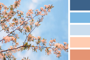
Work from Home
Okay. So that’s what it looks like outside, but we’re sure you’ve been seeing a lot more inside lately. Fear not! We’ve got a color palette for that.
We’re channeling our inner Stay Home, Stay Safe for a color palette that just screams comfort. The greens represent your favorite indoor plants, while the whites are for that oh-so-coveted toilet paper (who would have ever thought we’d be saying that?).
This palette’s great for a rainy spring day. Try it for an invite to a digital event, or even just use it to redecorate your office. Get creative! Now’s the time.
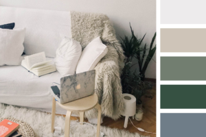
The Spring Break that Wasn’t
Or maybe it’s the Spring Break that’s going to happen next year. All we know is that we’re obsessed with dreams of travel right now, so why not share those in a fun color palette?
These bright colors have us thinking about spring sunsets, bright flower blossoms, and all the fun of visiting new places. It’s like all of our favorite things about the season rolled into one palette. Maybe it’ll inspire some awesome trips in the future.
Use this palette for any sort of eye-catching design you need, including social media graphics, website hero images, and more. Just maybe bring some sunscreen if you do. We’re already starting to get sunburnt.
Can’t get enough color? Check out our summer, fall, and winter color palettes. Once you do, get in touch with us. We can’t wait to work with you and make your true colors shine.


Responses