
Love fall color palettes? Check out our updated blog by clicking here.
Our color palette blogs are almost as popular as our grammar ones, it’s a close race. This blog will be the deciding factor.
We’re talking fall colors, so grab a sweater, turn on your heater, get comfortable, and check out the best and brightest in autumn hues.
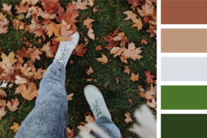
Gourdgeous
Nothing says fall quite like gourds, pumpkin, butternut, acorn and spaghetti squash. Their colors are vibrant and remind us of comfy blankets and the smell of fall leaves.
This color palette honors these great gourds with desaturated tones of yellow, tan, and orange, all grounded by a dark green. Use this for decorations, invitations, signage, and more.
Works best when paired with a Pumpkin Spice Latte, obviously.
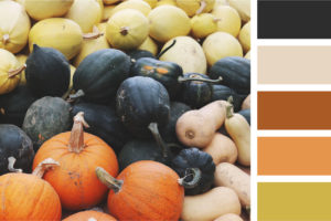
Unbeleafable
There is nothing better than the smell of leaves on the ground or your neighbor excessively burning them. Seriously Bob, you’re gonna set the neighborhood on fire.
The two greens make you want to frolic through an autumn field, while the browns crunch beneath your feet. The gray represents those early October mornings. Use this when you need to create refined documents that still evoke an autumn flare.
Works best when paired with hot apple cider. It’s up to you whether or not it’s spiked (ours absolutely will be).
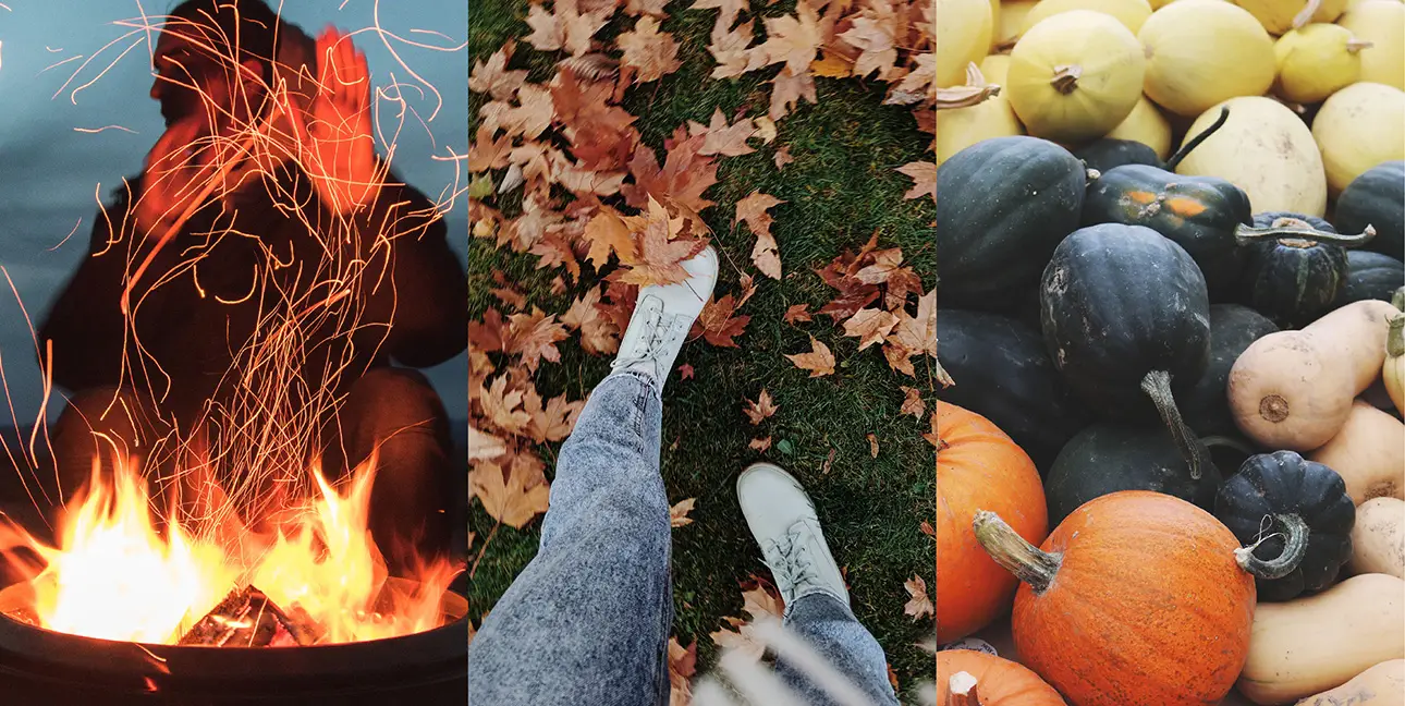
Inspfired
We’re HUGE fans of fall bonfires, especially after a cold day spent outside. These are a great way to warm up, along with iced wine and s’mores.
That’s what inspired this smoldering palette. The bright red and orange are grounded by a dark, deep crimson, which is the color of smoldering coals. All of this contrasts with the blue grays of an autumn dusk. Just looking at the palette makes us smell bonfire. Use this to break up the typical aesthetic of the season. It’s great for punchy events, eye-catching flyers, and more.
Work best when paired with: hot cocoa, especially when you’ve roasted marshmallows to go with it.
Are you in love with our palettes? We know they’re pretty awesome. Let us put our design skills to use for your brand. Contact us, and let’s get those colors flying.


Responses