
We’re stepping up our color palette game this fall with some complimentary fonts. So fancy. We’ve all been in a bit of a fall craze the last few weeks with the changing temperatures and colors, and of course, pumpkin spice and plaid everything. We’ve already shared with you some of our favorites of fall, so it seems only appropriate that we share with your our favorite colors and fonts of fall. Whether you’re looking for a little sweater weather design inspo or just wishing you were walking through the woods, cozied up with a blanket or picking pumpkins, we’ve got what you need! Feast your eyes on these little beauties and feel all the fall feels with us.
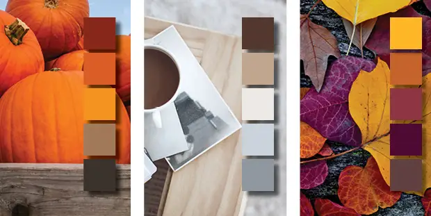
 CRISPY WALK THROUGH THE WOODS
Crispy air and crunchy leaves — nothing describes fall better. We go from the lazy days of summer to cooler temperatures and dozens of outdoor activities. Those muted warm tones on the ground and in the trees give off an energetic vibrancy that reflects the mood of the season. Reds and oranges are known for expressing liveliness and purple tones for sparking creativity. This palette pairs perfectly with a condensed sans serif. We chose Abraham Lincoln, for its variations of thicks and thins and its joyful personality. It is sturdy, but still gives a wispy in the wind, carefree feel to compliment our falling leaves.

COZY & CASHMERE
The best part of colder temperatures is keeping warm and cozy. These soft tones pair best with a light sand serif font. We used Raleway for its gentle curves and elegant lines. It compliments the cool hues without overpowering and changing the mood. Blues are reflective of relaxation and known to calm; everything you need for a crisp morning with a hot cup of coffee.
 PUMPKIN PATCHIN’
Lets travel through a pumpkin patch and discover all the hues and tones that are a staple of fall and all it’s beauty. We have paired these reds, oranges and browns with a hand-written script font to compliment the organic, and unrefined shapes of the pumpkins and gourds and all our favorite fall elements. The rustic palette brings out the natural earthy qualities of the font choice, Malina, with dark reds to and move into warmer, rich oranges and yellows of pumpkins in the fall. With this pallet you will be on your way to a pumpkin patchin success.

The way you show up at work shapes how people remember you.
Last month, alyshiahull joined bodespeaks on Happy Hour Hustle to talk about what workplace authenticity really means. Alyshia is a New York-based freelance journalist who writes for Business Insider, Fast Company, USA Today, Inc., and Entrepreneur. If you are ready to bring your authentic self to work, episode #134 is for you.
Listen to Happy Hour Hustle on Spotify, Apple Podcasts, and Youtube. Link in bio.

The power of the Women`s Entrepreneurial Fellowship, in a graduate`s own words:
"Growth is never accidental, it comes from being willing to learn, adapt, and embrace change. After nine months of dedication, reflection, and business development, I proudly graduated from the Women`s Entrepreneurial Fellowship (WEF) during the Small Business Association of Michigan Annual Meeting.
Throughout the program, I challenged myself to evaluate every aspect of my business, celebrating what was working while identifying opportunities for growth and improvement. The journey was made even more meaningful through the support of an incredible cohort of women entrepreneurs, the guidance of mentor Gina Jacquart Thorsen, and the leadership of bodespeaks and her team.
A sincere thank you to smallbusinessassocofmichigan for investing in second-stage women business owners and creating opportunities that empower entrepreneurs to build stronger, more sustainable businesses."
— Mary A. Barton, President and CEO of Equitable Accounting Solutions and proud WEF graduate.
Applications for the next cohort are now open. Link in comments.
"Out of failure comes growth – you have to see it as an opportunity."
bodespeaks joined cuzzinjustin on the strictlyfromnowhere Podcast for an honest conversation about entrepreneurship, embracing your superpowers, and building a personal brand that`s actually yours, the wins, the setbacks, and everything in between. And naturally, dropped an f-bomb or two along the way. You don`t want to miss it.
Full episode in the comments 👇
AI doesn`t treat every source equally; it trusts what`s credible, cited, and current, like news coverage.
Showing up in the right places isn`t just good PR. It`s how the robots (and the humans) get you right.
Read the full blog at the link in bio.
"If you don`t get up and grind every day, the needle isn`t gonna move."
We sat down with brandonmccraney, founder and Master Blender behind olderaleighdistillery in Zebulon, North Carolina. Brandon spent fifteen years just thinking about whiskey before he finally opened his doors, and even then it took four more years, a dozen rejections, construction delays, and a global pandemic to get there. Two years later, Olde Raleigh had already won Best Micro Distillery in the US.
Check out the latest episode of Happy Hour Hustle, where Brandon shares what it actually took to grow a business through COVID, the military discipline that kept him going when everything else said quit, and how working with people turned out to be the hardest part of the job.
Listen to Happy Hour Hustle on Spotify, Apple Podcasts, and watch the whole episode on Youtube. Link in bio.
It`s 9 months that is impossible to sum up in a video - but here`s just a taste.
This Women`s Entrepreneurial Fellowship is resources, mentorship, and connections that you can`t build anywhere else. We`re so exicted for what the next cohort will bring.
Apply now at the link in bio.
smallbusinessassocofmichigan


Responses