
To begin 2015, we thought we would go back to the basics and investigate the building blocks of graphic design. Graphic design is not just about creating an awesome poster. A designer has to juggle fonts, imagery, and space to create a balanced layout. The most basic and most overlooked aspect of design is type, so we thought we’d introduce the basics in our design blog this month.
Anatomy of Type
As a designer it is important to understand the anatomy of a font. This knowledge allows you to better pair fonts that work aesthetically well with each other and within the style of design you are creating.

Now that you have a basic understanding of the anatomy of a letter we can talk about the different styles of letters. This is where history meets paper and the digital world. Each font style has a history and works differently in any given piece. We’ll do our best to explain here:
Serif
A serif font is one that has small spurs or blocks that extend past the stem of a letter that can be seen in the chart above. There are three main styles of Serif font; Slab Serif, Old Style and Modern or Didone.
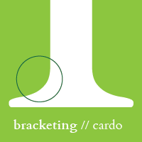 Old Style fonts have serifs connected to the stem of a letter through a rounded corner called bracketing. The stroke and stem of the letter in Old Style typefaces are consistent making these fonts easier to read at small sizes. The serifs add an even more readability to this style because of the small differences the cause in each letter. These fonts include fonts like Bembo and Baskerville.
 Slab Serif fonts have large blocky serifs, easily recognizable from the block M of University of Michigan. These serifs come off the stem of the letter at a right angle (un-bracketed). This style of typeface can be used successfully with sport or very geometric graphics. Some popular examples include Rockwell.
Modern (Didone). These fonts have a dramatic contrast in the thick and thin strokes of each letter that commonly end in a non-bracketed serif. While these fonts portray a clean and elegant feeling, they are best not used in small font sizes. The dramatic difference in line width can cause thin sections of the letters to be lost at small sizes. One of the most used Didone typefaces is Bodoni.
San Serif
These fonts are usually classified as more modern in aesthetics. The letters are absent of serifs and have a more scientific or bold look to them.
Geometric. True to its name, geometric type have the appearance of perfect curves and lines. This style of type is greatly used in designs that need to convey ideas of technology, science or cleanliness. It could also be used in designs that are highly illustrative or busy and need a readable contrast typeface. Fitting into this style of type is one of the most popular fonts out there, Futura.
Grotesque. This san serif style bridges a geometric and humanistic font by squaring curves, this style is most apparent in the “D” or “R” of the typeface. Many Grotesque type specimens have the bowl and loop lowercase “g”. The number one, most popular typeface that used in logos like Jeep and The North Face is a Grotesque typeface. Know what font we are talking about? Helvetica.
Humanistic. This san serif font has the most, if only noticeable, difference in stoke width. Meant to bring in a more calligraphic approach to the letters these letters do not appear as digital and clean when compared to other San Serif fonts.
 Script
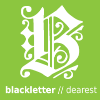
While script is greatly different from serif or san serif typefaces, it still has small subset categories of Formal, Casual and Blackletter script. The most recognizable and least seen of these styles is Blackletter. The ornate design of Blackletter fonts were first seen drawn out in the Gutenberg Bible. Obviously not practical for body copy, the use of Blackletter type decreased in popularity due to the invention of the letterpress and moveable type.
Decorative
Decorative fonts are created to use on larger format work for posters or headlines. Very diverse in nature and imagery, decorative fonts can be a flow of swirling letters, a distressed style or even image based. Because of the wide variety imagery and shape that these fonts have, they are not usually used at small sizes for body copy because of readability issues.
Now that you have a basic knowledge of the different font styles, it’s time to explore. Our two favorite sites for great fonts are Font Squirrel, which provides a variety of free copyright free fonts and My Fonts, who runs specials every month for great typefaces at a lower price.


The way you show up at work shapes how people remember you.
Last month, alyshiahull joined bodespeaks on Happy Hour Hustle to talk about what workplace authenticity really means. Alyshia is a New York-based freelance journalist who writes for Business Insider, Fast Company, USA Today, Inc., and Entrepreneur. If you are ready to bring your authentic self to work, episode #134 is for you.
Listen to Happy Hour Hustle on Spotify, Apple Podcasts, and Youtube. Link in bio.

The power of the Women`s Entrepreneurial Fellowship, in a graduate`s own words:
"Growth is never accidental, it comes from being willing to learn, adapt, and embrace change. After nine months of dedication, reflection, and business development, I proudly graduated from the Women`s Entrepreneurial Fellowship (WEF) during the Small Business Association of Michigan Annual Meeting.
Throughout the program, I challenged myself to evaluate every aspect of my business, celebrating what was working while identifying opportunities for growth and improvement. The journey was made even more meaningful through the support of an incredible cohort of women entrepreneurs, the guidance of mentor Gina Jacquart Thorsen, and the leadership of bodespeaks and her team.
A sincere thank you to smallbusinessassocofmichigan for investing in second-stage women business owners and creating opportunities that empower entrepreneurs to build stronger, more sustainable businesses."
— Mary A. Barton, President and CEO of Equitable Accounting Solutions and proud WEF graduate.
Applications for the next cohort are now open. Link in comments.
"Out of failure comes growth – you have to see it as an opportunity."
bodespeaks joined cuzzinjustin on the strictlyfromnowhere Podcast for an honest conversation about entrepreneurship, embracing your superpowers, and building a personal brand that`s actually yours, the wins, the setbacks, and everything in between. And naturally, dropped an f-bomb or two along the way. You don`t want to miss it.
Full episode in the comments 👇
AI doesn`t treat every source equally; it trusts what`s credible, cited, and current, like news coverage.
Showing up in the right places isn`t just good PR. It`s how the robots (and the humans) get you right.
Read the full blog at the link in bio.
"If you don`t get up and grind every day, the needle isn`t gonna move."
We sat down with brandonmccraney, founder and Master Blender behind olderaleighdistillery in Zebulon, North Carolina. Brandon spent fifteen years just thinking about whiskey before he finally opened his doors, and even then it took four more years, a dozen rejections, construction delays, and a global pandemic to get there. Two years later, Olde Raleigh had already won Best Micro Distillery in the US.
Check out the latest episode of Happy Hour Hustle, where Brandon shares what it actually took to grow a business through COVID, the military discipline that kept him going when everything else said quit, and how working with people turned out to be the hardest part of the job.
Listen to Happy Hour Hustle on Spotify, Apple Podcasts, and watch the whole episode on Youtube. Link in bio.
It`s 9 months that is impossible to sum up in a video - but here`s just a taste.
This Women`s Entrepreneurial Fellowship is resources, mentorship, and connections that you can`t build anywhere else. We`re so exicted for what the next cohort will bring.
Apply now at the link in bio.
smallbusinessassocofmichigan


Responses