
We love doing color palette blogs, and you guys eat âem up like candy. As far as weâre concerned, itâs a win-win. Anyway, we know youâre not really reading this part. Youâre going to skim this intro and then go scroll down to see all the pretty colors, right? So letâs not drag our feet anymore. Itâs time for winter color!
(C)hill
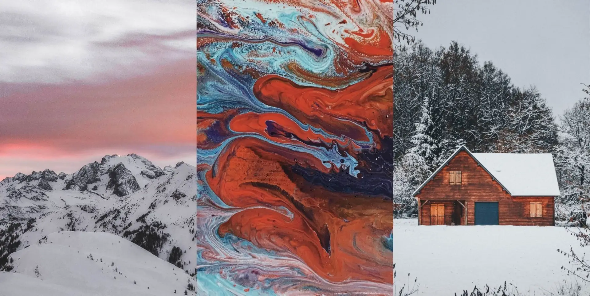
The holidays are gone. Itâs time to throw out all the green and red and silver and gold. Letâs get pretty in pastels! This sunset on a snowy mountain just screams winter, doesnât it? Break out these colors the next time you need to make a social media graphic or an event invite. This palette is soft and professional. We recommend theme an entire event in these colors. Contact our friends at www.alpineevents.com they can help you out.
B/cold
Sometimes you can draw inspiration from abstract images, and this one really captured our eye. The red and blues really play up the fire and ice feel, and theyâre wonderful for the dead of winter and when it starts to thaw. Mix in this color palette to create eye-catching graphics for signs, social media images, promo items or even direct mailers. Did we mention that classic blue is the color of the year? Hereâs an excuse to use it.

T/free
Itâs time to enjoy the cold while getting comfy at home. We love this winter cabin theme, complete with snow-dusted trees and the warmth from the cabin. Evoke the same idea with gray, desaturated browns, and a deep teal. This palette is wonderful for formal invitations, website color palettes, and client gifts. The cool colors evoke winter while the warmth promises the spring thatâs just around the corner. All in all, weâre in love with this one.

Canât get enough? Check out our fall and summer palettes. We even have winter colors from last year, if you need more chill. Check all of those out, and then get in touch with us. Weâll help you fine a color palette thatâs perfect for you, all year round.


Responses