
First off, if you haven’t read part one of our Healthy Battle Creek case study, go do that now. We’ll wait.
All set? Good. Let’s continue.
Like we said last time, Healthy Battle Creek is an awesome initiative in Battle Creek designed to help provide PPE and food for the community during the COVID-19 pandemic. It’s no wonder we’re so proud to be part of the movement. Here’s how else we helped out.
Our Task
Our team was first tasked with developing a logo for Healthy Battle Creek. Following the initial logo design, we created a full brand, landing page, and print collateral before their first PPE drive. Did we mention this was all done in a week? Yeah, we’re pretty awesome.
Goal
When developing the logo and brand, we wanted to encompass the themes of community and inclusivity. It was necessary for the overall brand to feel fun, family-friendly, and supportive. The goal was to bring awareness to the new initiative and to let people know about the drive.
Process
Our branding process is a ton of fun. We followed these steps to develop Healthy Battle Creek’s logo.
- First, we met with the Healthy Battle Creek team to chat through their initial thoughts about how they envisioned the brand for their new initiative.
- Our creative team drafted up lots of logos.
- We held an internal battle royale to pick our favorites.
- We presented the top three logo options and two color palettes to our client.
- From there, we went back and forth with Healthy Battle until they were happy.
- We created the awesome, community-focused logo below!

Following the logo creation, we finalized the overall brand. The color palette was important to us to convey the themes the brand needed to embody. We landed on an inviting, warm and bright color scheme to showcase this.
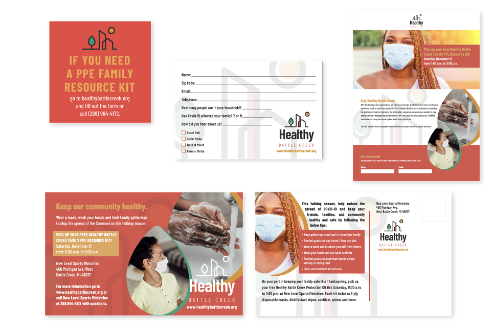
Once we found a color palette that complemented the logo and overall “vibe” of the brand, we were able to crank out several cohesive deliverables to get the word out about the PPE drive. These deliverables included direct mailers, social media graphics, a landing page, and more.
Below are some of our favorites:
We’re all about integrated, especially when it comes to branding and design. We want to ensure that all pieces, from print to digital, are consistent and align with your overall brand!
Need help getting your brand out there? Get in touch.


Responses