
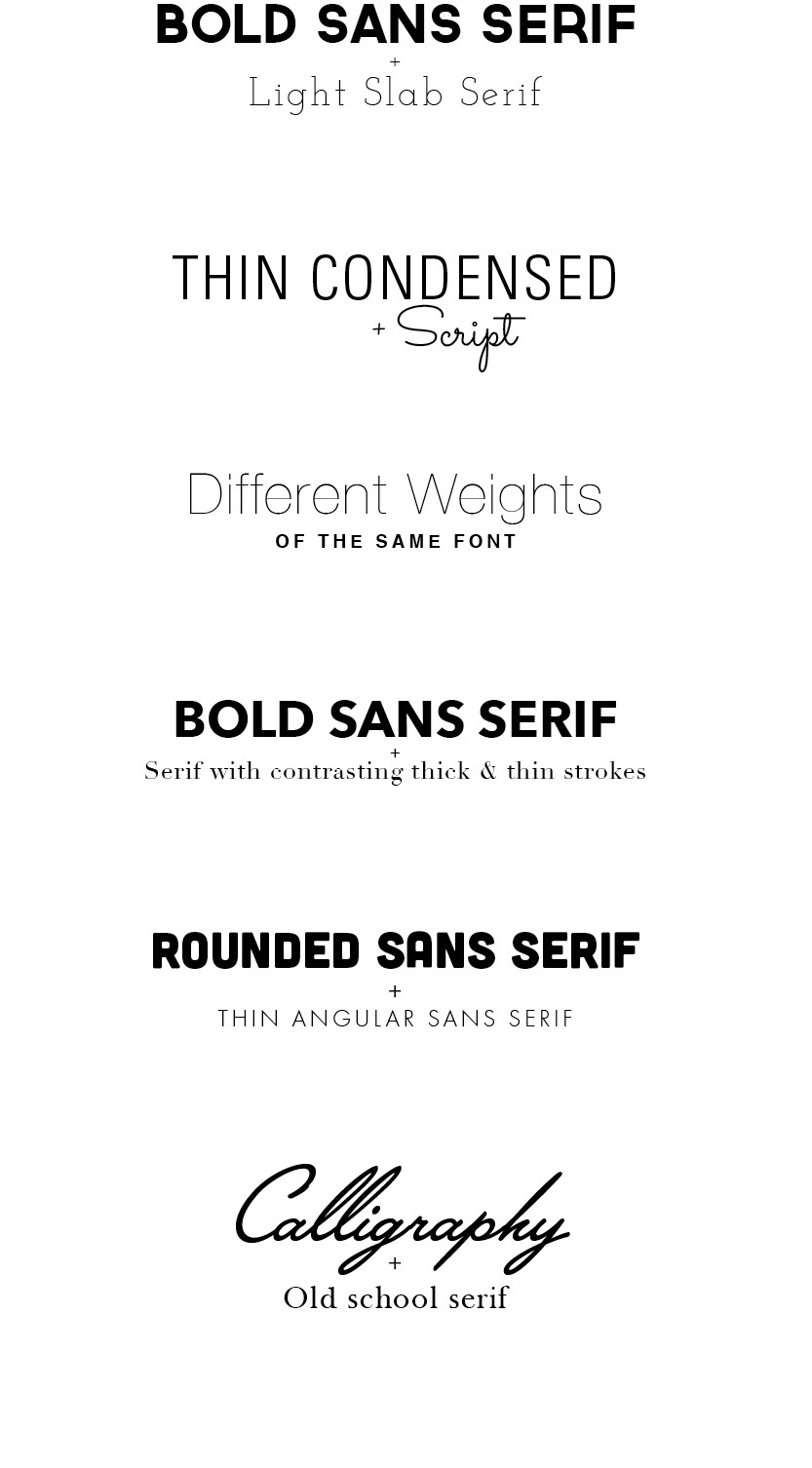
Typography is absolutely essential to every project a designer creates: layout, composition, brand identity, etc., because type can convey almost any message to your audience. An image, graphic, or other elements a designer uses can present one message on its own and take on a totally different meaning when paired with different fonts, used in different ways. Fonts themselves are similar in this aspect. Working on a project that requires type pairing, like developing a new identity, can be challenging and extremely time consuming because there are millions of fonts to chose from.
Choosing a direction for a primary font can be obvious, sometimes you know exactly what works. You can look at a design, brand, or message and associate that with a certain type of font, whether serif, sans serif, bold, light, condensed, extended, etc. However, your design also requires a secondary font in contrast to the headline font, for use in subheads, body copy, and other areas of text. Along with size, proximity, position, and color, font choice is crucial to creating hierarchy and organization within a composition.
Not all fonts are appropriate when used in conjunction with one another. Finding a font that compliments the overall feeling that is being communicated is more complex. Secondary fonts can easily manipulate the voice of the primary font. So it is important to know how to pair in order to create the appropriate combination for the individual project. One type combination may be gold for your current project, but look ridiculous with another.
Designers, especially those living the agency life, rarely have the time to devote hours to finding that perfect font combo. So by streamlining that process, and creating a guide to narrow down the search, things go a bit smoother. There are fonts of different categories that just work well when paired with each other. Not all fonts in each category apply of course, but narrowing down your search from the get-go saves you some time. So, during your font search always remember:
– Contrast is key
– Some people say opposites attract… however, fonts that communicate different tones or feelings often
create too much conflict
– Fonts that are too similar also create awkwardness and are disruptive to your design
Combinations of the following are a great place start:

The way you show up at work shapes how people remember you.
Last month, alyshiahull joined bodespeaks on Happy Hour Hustle to talk about what workplace authenticity really means. Alyshia is a New York-based freelance journalist who writes for Business Insider, Fast Company, USA Today, Inc., and Entrepreneur. If you are ready to bring your authentic self to work, episode #134 is for you.
Listen to Happy Hour Hustle on Spotify, Apple Podcasts, and Youtube. Link in bio.

The power of the Women`s Entrepreneurial Fellowship, in a graduate`s own words:
"Growth is never accidental, it comes from being willing to learn, adapt, and embrace change. After nine months of dedication, reflection, and business development, I proudly graduated from the Women`s Entrepreneurial Fellowship (WEF) during the Small Business Association of Michigan Annual Meeting.
Throughout the program, I challenged myself to evaluate every aspect of my business, celebrating what was working while identifying opportunities for growth and improvement. The journey was made even more meaningful through the support of an incredible cohort of women entrepreneurs, the guidance of mentor Gina Jacquart Thorsen, and the leadership of bodespeaks and her team.
A sincere thank you to smallbusinessassocofmichigan for investing in second-stage women business owners and creating opportunities that empower entrepreneurs to build stronger, more sustainable businesses."
— Mary A. Barton, President and CEO of Equitable Accounting Solutions and proud WEF graduate.
Applications for the next cohort are now open. Link in comments.
"Out of failure comes growth – you have to see it as an opportunity."
bodespeaks joined cuzzinjustin on the strictlyfromnowhere Podcast for an honest conversation about entrepreneurship, embracing your superpowers, and building a personal brand that`s actually yours, the wins, the setbacks, and everything in between. And naturally, dropped an f-bomb or two along the way. You don`t want to miss it.
Full episode in the comments 👇
AI doesn`t treat every source equally; it trusts what`s credible, cited, and current, like news coverage.
Showing up in the right places isn`t just good PR. It`s how the robots (and the humans) get you right.
Read the full blog at the link in bio.
"If you don`t get up and grind every day, the needle isn`t gonna move."
We sat down with brandonmccraney, founder and Master Blender behind olderaleighdistillery in Zebulon, North Carolina. Brandon spent fifteen years just thinking about whiskey before he finally opened his doors, and even then it took four more years, a dozen rejections, construction delays, and a global pandemic to get there. Two years later, Olde Raleigh had already won Best Micro Distillery in the US.
Check out the latest episode of Happy Hour Hustle, where Brandon shares what it actually took to grow a business through COVID, the military discipline that kept him going when everything else said quit, and how working with people turned out to be the hardest part of the job.
Listen to Happy Hour Hustle on Spotify, Apple Podcasts, and watch the whole episode on Youtube. Link in bio.
It`s 9 months that is impossible to sum up in a video - but here`s just a taste.
This Women`s Entrepreneurial Fellowship is resources, mentorship, and connections that you can`t build anywhere else. We`re so exicted for what the next cohort will bring.
Apply now at the link in bio.
smallbusinessassocofmichigan


Responses