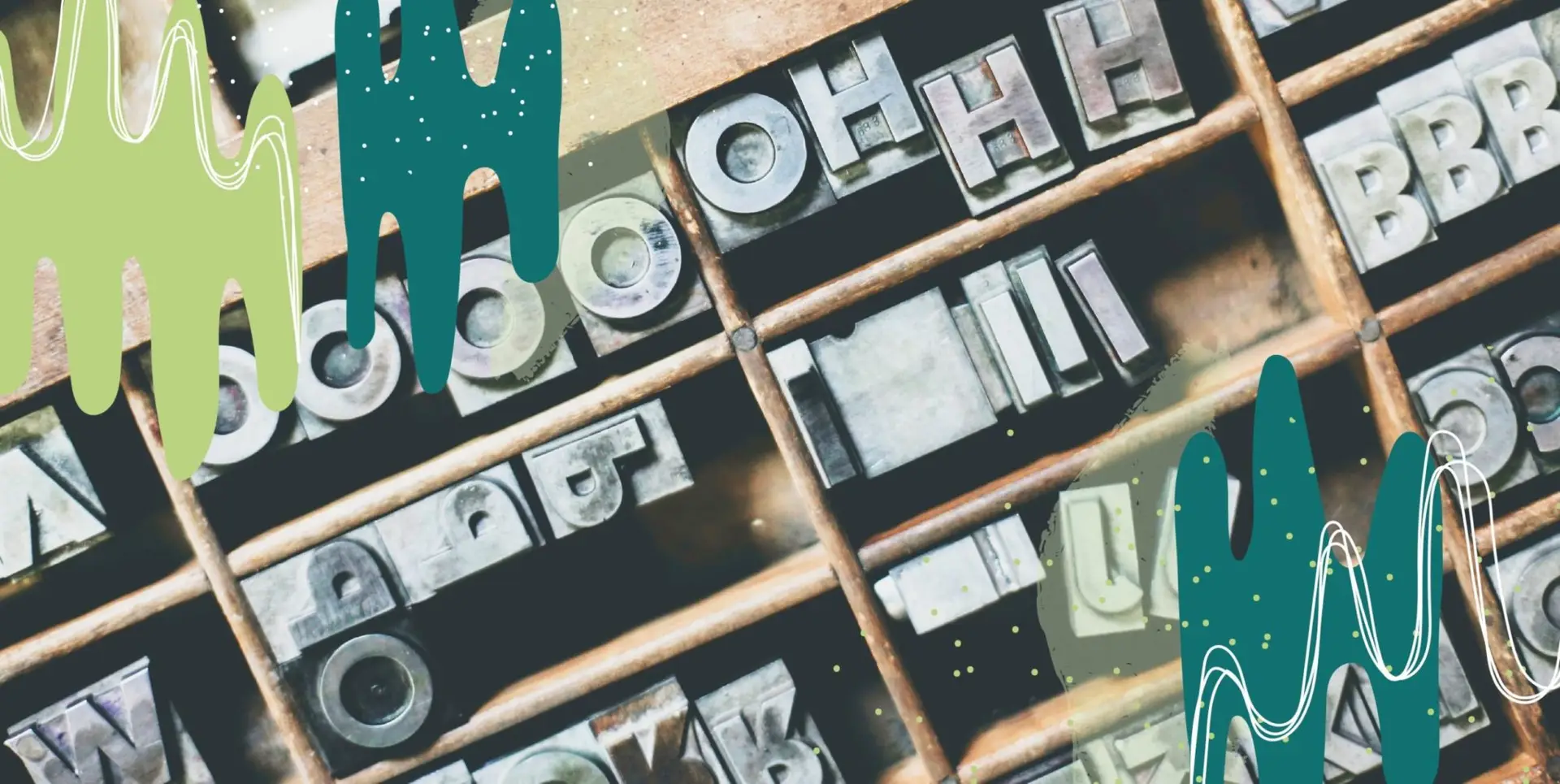
Around here, we talk a whole lot about design. It’s a part of everything we do. When we want people to get the message, we pair it with an awesome social graphic, pamphlet, or some other beautiful design piece. When you look at a graphic, brochure, sign, billboard, etc. you don’t automatically register font choices, you do know if it sucks or if it doesn’t look right. This all comes back to typography, here are the dos and don’ts.
You’ve Gotta Read It
What’s the most important thing about words? They need to be legible. That means when you go searching for a font, keep the purpose in mind. Think about how you’ll use the font, where it’ll go in a design and how it’ll function. Think about a flyer or invite you’ve seen recently. The title should be the biggest or most emphasized, with a sub-header to grab attention under that. Then all you need is clean, readable body copy, and you’re good to go. When you resize text, make sure you’re scaling it and not stretching it. That can make even the best font look like funky and not in a good way.
Set the Mood
Your design is trying to convey something. Don’t lose sight of what that is. When you design a wedding invite, you’re probably not going to use Chiller (unless it’s a spooky Halloween wedding), and when you work on a football flyer, you won’t want a cursive script. Your font should match the tone of what you’re trying to convey. Oh, and don’t forget colors. Even the most fitting font can seem wildly out of place if you don’t use colors that work together. It’s easy to lose fonts in the design if they don’t contrast, it has to be pleasing to the eye.
The Big Picture
At the end of the day, your font choice is going to impact the whole design, so you should keep the entire design in mind. (Have we said that enough? Good.) It’s a good rule of thumb to keep to no more than three fonts per project. Otherwise it gets pretty chaotic and confuses the intended audience. You want people to want to read the words, right? Not cringe at them. If you’re looking for variety without mixing up a million fonts, try adjusting the tracking (the horizontal space between letters and words in a group) or the leading (the vertical space between lines of text). This will give a bunch of variety to one font whenever you need it.
Got all that? We’re just full of awesome design tips. If you’re ready to work with a team who knows how to pull out all the stops, get in touch with us. We’d love to chat!
P.S. Delete Comic Sans and Papyrus from your library.