It’s officially summer, a.k.a. the best time of year!
It doesn’t get much better than beaches, ice cream, drinks on the patio (beer for me, please). Summer is also the perfect time to get our design vibes flowing. Some of the summer design inspiration we are going to highlight is very reflective of 2017’s design trends. Design, whether it be graphic design, type design, web design, or even fashion design, doesn’t necessarily change with each season. However, that doesn’t mean we can’t break it down and look at how some of these elements can inspire our creations during the summer season.
Seasonal trends also may not be right for every brand. But, for those that can alter their imagery and layouts to connect more with their audience, should do so (After all, your audience is probably soaking up the summer sun while we, the designers, try to to figure out the latest design debacle).
Colors
At 834 we love color, and if you’ve been to our office, you would understand (I would even say that we are the color experts – No bias, of course). This year’s trends will never be able to completely escape the Pantone color of the year, and luckily greenery is a perfect color for summer layouts. Greenery has a fresh-cut feel and crisp hue, which is sure to bring life to anything you create.
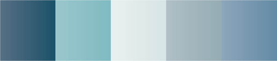
But, we cannot forget about cool tones. Blues are known to give off a calming, relaxed energy, similar to ocean waves, wispy clouds in a blue bird sky, etc. We created a few custom color schemes last year that also have similar personalities (pictured below). These colors are a bit more vibrant than this year’s direction, but you can mix and match and color schemes to create your own for your projects.
Fonts
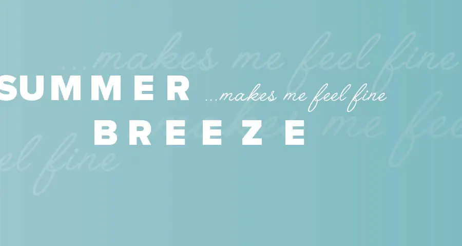
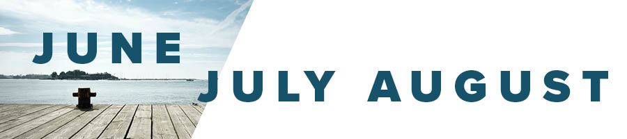
Fonts are tricky because you don’t want to get too off brand. Since the summer calls for relaxed trends, we recommend using some bold fonts to contrast with muted colors. Think harsh angles like Futura (we’ve used Proxima Nova Black, below) mixed with a soft, flowy script. Pictured below, we’ve paired our bold font with Angelface, which has a more consistent line weight allowing it to give off a smooth, less structured feel.
Tip: Try not to use a typeface with an extreme variation in line weight. Line weight variation can create an elegant, sophisticated feel that we don’t want for our laid back, summer designs.

Layouts
Keep these minimal. This trend is nothing new, but minimal, modular layouts are very “in” this year. Use white space in your layout to allow for a “wide open” feel. Pair this with geometric elements for the right combination of airy movement and modern structure. We also recommend using high contrast within your colors and elements to give your design edginess.
When you’re working with seasonal elements make sure you keep your audience in mind. It’s easy to forget that behind a brand are the target audience, who’s opinions matter most. Designers should never forgo brand guidelines to keep up with seasonal trends, but it doesn’t hurt to make occasional slight changes.
My recommendation: This summer give your structured brand imagery a break and have some fun.