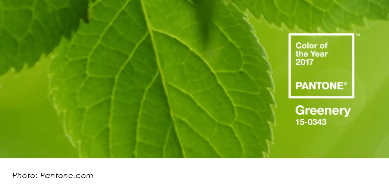
Pantone’s 2017 Color of the Year: Greenery
There has been a lot of talk about Pantone’s choice for the 2017 Color of The Year. We get so many questions as it relates to Pantone’s color direction, but the most frequently asked question is “should we use this color within our marketing, advertising or branding materials?” Before we answer that question, we must dive deeper into the Pantone color system, as well as how, why and who, chooses Pantone’s Color of the Year.
Why does the Pantone system matter?
Pantone is the color matching system used by design professionals to ensure consistency in color across all mediums, including: materials, products and presses. Pantone inks are created by very precise color formulas that allow for consistency in branding, something that would otherwise be unachievable.
Different materials absorb ink in different ways, which is why Pantone has multiple books that address the variation of ink absorption. The goal of the Pantone system is to provide a set of swatches that are used to produce accurate color representation. Pantone has become a universal system, proving the system’s major influence in the world of color.
How is the Color of the Year chosen? Who chooses this?
Each year Pantone invites people from different industries to contribute to the color decision making process. Years of planning go into identifying which colors are worthy of making a cross-industry appearance. One of the largest contributing factor’s of this process is identifying Pantone’s target audience. and how the chosen color will be perceived across all cultures and countries. In other words, color theory, color meaning, symbolism, and connotation are all factors that must be taken into consideration when choosing the Pantone Color of the Year.
According to Pantone, the 2016 colors of the year; “Joined together Rose Quartz and Serenity demonstrate an inherent balance between a warmer embracing rose tone and the cooler tranquil blue, reflecting connection and wellness as well as a soothing sense of order and peace.” Rose Quartz is shown below-left. Serenity is shown below-right.


As for this year’s color decision making process, Pantone considered the current social environment when making their decision. “Greenery bursts forth in 2017 to provide us with the reassurance we yearn for amid a tumultuous social and political environment. Satisfying our growing desire to rejuvenate and revitalize, Greenery symbolizes the reconnection we seek with nature, one another and larger purpose” according to Pantone.
So, should you use this color in your materials?
There are a few different ways to answer this question.
- Unless the Greenery description (listed above) fits your brand’s personality, is relevant to your audience, product and placement, then the answer is, “no, Greenery is not for you.”
- If Greenery matches with your existing palette, and can be used to promote a campaign or support your branding, then “yes, you could make Greenery work.”
- If you want to use Greenery in order to get more recognition from your audience, the answer is “no, Greenery is not for you.”
Color is incredibly important to the visual communication of your brand’s identity, personality and values. Color should be strategically researched, developed and implemented to yield the best connection with your audience. Of course, there are a hundred ways to address, “Should Pantone’s Color of the Year effect your visual brand direction?” At the end of the day your color choice should be based on whether or not it is a good fit for your brand, not just because it is Pantone’s Color of the Year.
(P.S. How ironic is it that Greenery matches our brand? We’re the lucky ones.)