
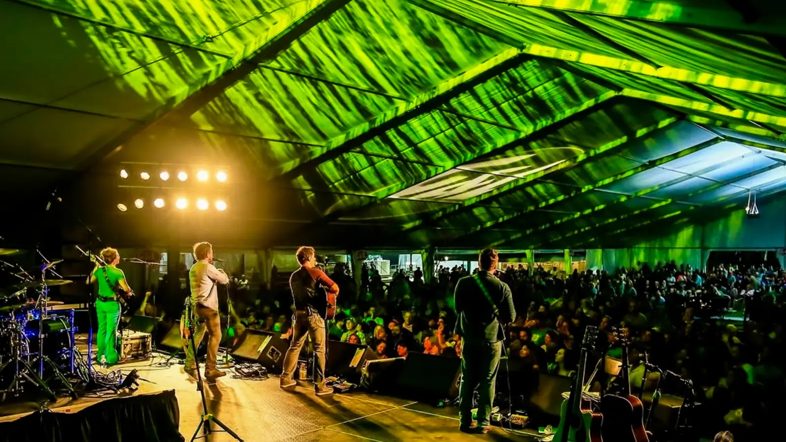
After 25 years of bringing Irish culture to the Midwest, the Michigan Irish Music Festival (MIMF) needed a change, and they needed it now. The volunteer-driven festival needed a branding refresh to bridge generations and attract younger audiences while keeping it authentically Irish.
Getting Started
When they came to us, we knew we couldn’t just slap a shamrock on a new logo and call it a day. MIMF’s audience (and our team) cares way too much about Irish culture to phone it in with some stereotypes. Instead, we wanted to get to the heart of what makes MIMF unique. To get started, we sent out surveys to hear from their loyal fans and volunteers about what makes the festival tick. The results? MIMF is way more than just a music festival—its team acts as cultural ambassadors who create experiences that matter, whether you’re Irish or not.
Here are the main takeaways we discovered:
-
- The festival is 100% run by volunteers
-
- They welcome everyone, not people who can trace their families back to Ireland
-
- Their music isn’t stuck in the past—it spans across traditional and contemporary styles
-
- They wanted to attract younger demographics without making their die-hards feel unwanted
- They wanted to attract younger demographics without making their die-hards feel unwanted
Our strategy? Create a brand that is:
-
- Vibrant as hell (no more muted greens, thanks)
-
- Rooted in authentic culture, not leprechaun stereotypes
-
- Welcoming to everyone
-
- Flexible enough to work everywhere
-
- Eye-catching enough to make new, young guests stop and notice
- Eye-catching enough to make new, young guests stop and notice
Blending Traditional with Modern Design

Color Palette
The color palette tossed aside the muted greens you see in every Irish pub and drew inspiration from the vibrant landscapes of County Cork. These bright, energetic hues reflect the region’s stunning coastlines, lush fields, and dynamic urban scenes. Of course, we kept some green (we’re not monsters), but we added zesty yellows, bold oranges, and refreshing cyans that capture the vibrancy of modern Irish culture.
The colors became a visual metaphor for the festival’s mission: honoring tradition while embracing innovation. Emerald Encore grounds the palette in classic Irish green, while Celtic Surge, Bodhrán Beat, and Lakeshore Song inject the kind of energy and excitement you might find in the streets of Cork or Dublin. This makes the brand more appealing to younger audiences while challenging that tired mental image you picture when you think about what Irish culture looks like.

Brand Assets
Instead of playing it safe (and boring) with shamrocks and pots of gold, we turned our attention to Celtic knots. And if you’re thinking “oh great, another Celtic knot,” think again. We made sure to incorporate them in eye-catching, dynamic ways without sacrificing what they symbolize—community, innovation, and cultural richness.
We developed a comprehensive asset library featuring Celtic-inspired abstract shapes that could be scaled, overlapped, and integrated across design contexts. Together, they help tell MIMF’s story without relying on overused or dated Irish imagery.

Typography
It’s easy to forget how important typography can be to telling a brand’s story. For MIMF, we needed bold fonts that wouldn’t get overshadowed by their bright color scheme. Rubik and Poppins are big and inviting while Sue Ellen Francisco adds some personality. By integrating Sue Ellen Francisco, we softened the brand’s professional edge, creating an approachable visual language that whispers “we’re glad you’re here.”

Results
Our rebrand doesn’t just look good—it works. MIMF now has a modern, approachable visual identity that maintains its traditional spirit while still giving it room to grow. The new brand language works across everything they might need, from swag to social and more. Old fans and new are bound to love the bright new look.
A rebrand is more than just a new logo—it’s about capturing an organization’s soul and launching it into the future. For MIMF, we didn’t just redesign a brand; we crafted a visual narrative that celebrates cultural connection, community, and the joy of music and culture without a single “top o’ the morning” in sight.
That’s what makes us different from other branding agencies. We don’t do safe. We do what works.


Responses