We dream of sunny summer days all year long, and it’s finally beginning to feel like the season is upon us. From vibrant blues on a hot beach day, to cotton candy sunset skies, the summer season has a hold on us with its fantastic array of color. Different from the pastels of spring, the warm rich tones of fall and the dark, bold look of winter, summer offers vibrant hues with cool undertones and some of the most energetic pallets of the year. Weather sipping a cocktail on the beach (the most likely place to find #Team834), splashing around in the pool, or taking in a painted sunset, we’ve got a color palette to reflect all your summer season moods. Take these as inspiration for your seasonal designs…or your summer show collection. Either works for us.

Fresh Squeezed
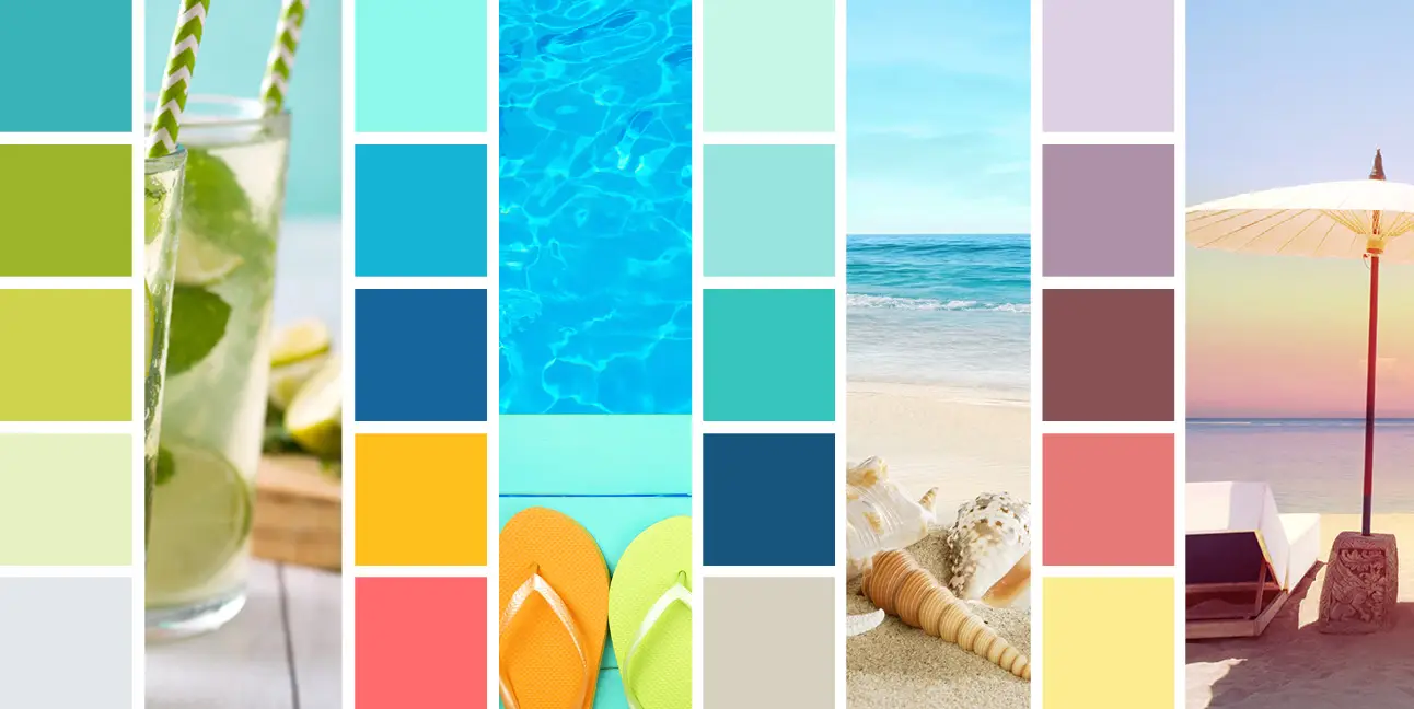
We see cool blue and greens in every direction throughout the summer months, especially here in Michigan. Blue skies, blue green lakes, green leaves, grass, and other garden plants, or simply a fresh squeezed lime in your chilled cocktail on the beach. Here we’ve combined a very cool palette (blues, greens, and purples) with warm undertones. The blue remains true to the cool end of the spectrum, but the greens have a bit of yellow, creating an energetic contrast between the two that still flow seamlessly when combined with each other. Warm undertones are are a great way to create more interest and variation within an overall cool palette.
Beach Bum
Summer is typically filled with vibrant, bright colors, but we often miss those darker, calmer tones that create incredible contrast. Restricting your palette to different shades and tints of one hue, in this case blue, can create visually amazing things. Here we have warm blues – the light grey/blue with red undertones, and the deep blue of the shadowed part of the waves. We’ve paired these with cool blues – the sky, the shallow areas of the water, and the crest of the wave. We call this a monochromatic color scheme. If done right, this type of palette can give you what seems like an endless amount of color combinations. Blues, greens, orange, pinks, and yellows can easily be used to create fantastic monochromatic schemes for summer.


Flip Flops and Bikinis
Of course, we cannot forget how warm tones play a significant role in our summer schemes as well. This palette creates a juxtaposition between the orange-reds and the blue-greens. For those of us well versed in color theory, we know these as complimentary colors, and in turn, warm mixed with cool. In terms of hue, orange is opposite blue, and red is opposite green – use that color wheel, people. Combining complimentary colors creates a so called vibration between the two that result in energetic movement throughout your design. Doesn’t that sounds like the perfect way to capture the pool party spirit? We think so.
Soft Summer Sunset
Pastels are often thought of as a thing of spring. But why not bring those into the summer season, as well? It doesn’t get much better than a radiant sunrise, or a soft sunset to end or start your day. A muted warm palette with cool undertones is a great way to show the other side of the summer we tend to forget, breezy evenings and nights. Combining warm and cool to mute your individual swatches a bit, gives that relaxing, calm feeling we get when the sun sets, the sky is filled with with yellows, pinks, and purples, and the waves have stopped crashing ashore. Try these combinations in a number of different ways to create your own perfect sunset.

Now that we’ve got you in the summer mood, channel your longing for that summer cocktail we keep mentioning into some beautiful designs. We are going to the same and imagine we are somewhere sitting in a summer breeze that makes us feel fine…
Want help incorporating some of these palettes with your brand? Reach out to kim@www834design.wpenginepowered.com.