

This is 8THIRTYFOUR ✨
We are scrappy, we are resourceful, and yes, we`ve all aged INCREDIBLY well.

Nobody is going to like everything you have to say. It`s hard not to take it personally, but you really shouldn`t.
Be yourself. Own your weird. Have the confidence of a mediocre white man.
Soft skills aren`t soft. They`re the difference between success and failure.
Kim is breaking down why poor communication is costing Michigan small businesses more than they realize, and what to do about it.
April 21 at the Michigan Celebrates Small Business Summit. Register at the link in bio.
It`s a good question everybody should be asking right now: how should you be measuring website efforts in the era of AI?
Our latest blog breaks down the metrics that actually matter in 2026: key events, traffic sources (yes, even ChatGPT), engagement rates, and the tools that make data less of a headache.
Link in bio.
The talent crisis is already here, and employers know it.
@bode834 recently spent time with a room full of West Michigan professional services business owners at TalentFirst, to hear about the workforce trends shaping our area.
If it`s keeping you up at night, too, we`re getting both sides in the room to talk about it.
Event info at the link in bio.
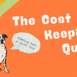
The voice that says you’re not enough... is lying.
All those things that make you weird are actually what make you strong.
Start owning it. Take the Quirks Quiz at the link in bio.

