‘Less is more’ is a little cliché, but for the sake of argument, we aren’t going to reinvent the wheel. It’s a concept that applies to a lot of different things: storage solutions, toilet paper, fonts, etc. The world would be a much more beautiful place if designers used this concept as a golden rule for creating anything that could or would be seen by the general public. If this were true, we would never again get that terrible feeling when picking up a menu, hoping your food wont be as sloppy as the cluttered chaos of poorly aligned type. Or driving by a billboard with so much copy, you put yourself at risk of driving right off the road and still have no idea what it was for. ‘Less is more’ is a magical little rule that can take even the most hideous branding and avoid the headache of clutter, confusion and disinterest.
Every project is different, but when it comes to copy, get right to the point. In the same way that people dislike reading long, drawn out emails, they also dislike, for example, having to scour an event poster to find simple information like the date, time, etc. We aren’t always patient and our lives run so fast that we aren’t going to slow down for something that doesn’t immediately answer our initial questions. What does the audience absolutely need to know? What will their first questions or reactions be? Whatever those answers are, focus on those as a starting point.
Additionally, focus on simplicity with your branding elements. Your visual brand is created for a reason, and that is to set a standard for visually communicating your message to your audience. Your visual elements are what keep all brand collateral, marketing and advertising campaign material consistent, even before the viewer is able to read and understand your messaging. Think about how long your particular project will be in front of the viewer. For example, when walking down the snack bar aisle at a grocery store, a product has less than a few seconds to grab your attention. To engage your audience, your product needs to be deliberately reflective of your brand, and not lost among the crowd of other colors, shapes and sizes. Designers, stop adding in visual fluff for the sake of visual fluff. Don’t get carried away. If it doesn’t aid in communication, don’t add it to your design.
Now that we’ve removed all the clutter, our design has some actual room to breathe. USE YOUR WHITE SPACE, PEOPLE…USE IT! This provides a nice little break for the eyes of your viewer and gives you as the designer the upper hand in guiding your audience through the information. The hierarchy of your information, meaning how you lay out each piece (more important elements holding more visual weight than less important elements), is also much more manageable when your design components aren’t fighting for space amongst themselves. Going back to your event poster, whether your most critical information is the title, date, time, location, or speaker, you now have control of what the viewer sees first, what they see next and so on. Thus, creating deliberate communication of each piece of information, with minimal confusion, frustration, and chaos. Now everyone, including you, is much happier, because your work has been received in a pleasant, effective manner.
Of course, there are many other ways to combat the disinterest of your audience, but concise copy, consistent branding, and deliberate delivery of information apply to every project you tackle. Don’t get lost in the crowd (or in your own head), design needs to be strategic, simple, and intentional; this will always help in avoiding the wrong visual direction.
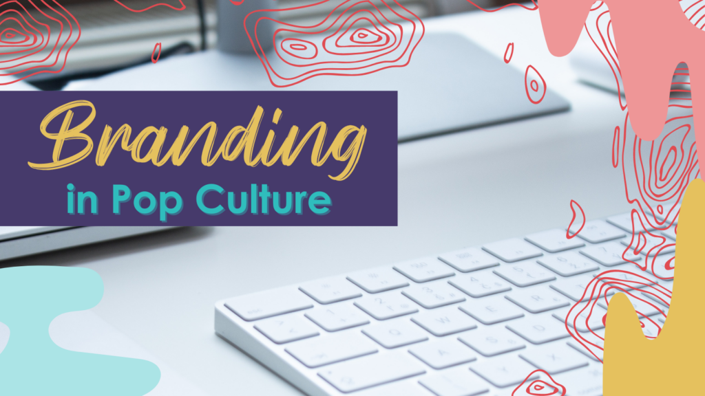
Did You License That?
Navigating the legalities of fonts can be a perplexing endeavor, particularly for busy entrepreneurs and marketers striving to make their content shine in the crowded


