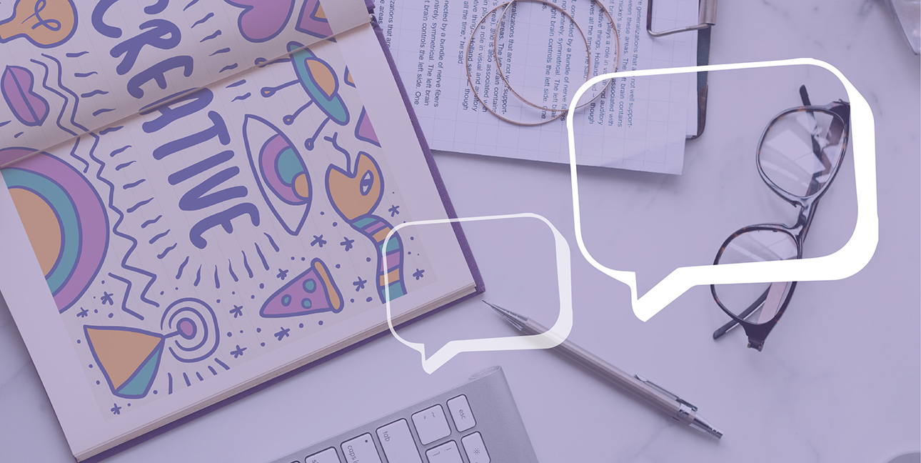
We love our creative team. Whether they’re whipping up flyers for a client’s last-minute conference or designing a logo for a new company, our team knocks it out of the park. Like…they’re really really good.
If you want to keep your designer happy, keep the following in mind. In fact, print it out, stick it on your wall.
“This should only take you a few minutes.”
Most of the time, this comes out when a coworker or client is trying to make a last-minute assignment or edit seem more manageable.
As a non-creative person, you have zero idea how much time goes into creating a design. Graphic designers have to focus hard on branding, rules of thirds, and all those other designy things.
Leave the time thing out.
“It needs something. I just don’t know what…”
This one’s similar to telling a writer, “It just doesn’t flow right.” As far as we’re concerned, neither of those statements count as feedback. Why? Well, feedback has to be actionable, you know, which means it needs to be super specific.
So, if you see something and your brain says, “Huh. Close but not quite,” tell it to shut up and focus. Pick something that you don’t like and (more importantly) suggest something that you would like. Vague feedback doesn’t help anyone, it just makes the designer want to punch you.
“Can you edit this .jpg?”
Short answer? No.
Long answer? Let’s talk about image file types for a second. Some file types (.psd, .ai, .indd, etc.) are made to be editable. That means graphic designers can open up different layers or parts of the image and tweak them without changing everything in the picture.
Other files types (.jpg, .png, .gif, etc.) don’t do that. It’s like taking a magazine, pointing to a page, and telling your designer to change something on it. Sure, they could, but they’d have to recreate the whole thing first.
“Can you use this photo from Facebook?
Social media is cool. We love it. But when it comes to images, it sucks.
Facebook, Twitter, Instagram, and all those other platforms compress images when they upload. They aren’t the full, detailed image that they were before they were uploaded. In fact, a lot of social media platforms save images in “lossy” file formats like .jpgs. These files get more and more grainy every time they’re downloaded and saved.
What does that mean for you? That image off of Facebook looks fine on your phone, but in a design, it’s going to be blurry or grainy.
“Try making it bigger.”
Have you ever heard the phrase, “Less is more?” Yeah, well. There’s a reason that’s a saying.
Empty space can make a big impact without making an image seem over-the-top or attention seeking. We aren’t saying you can’t have a big, colorful image; Kim loves when our designs are bright and cheerful. But when we do it, we make sure to save some space around the edges, so people looking at it don’t want to scratch their eyes out.
White space is totally in. Trust the designer.
Are you looking for a team that knows how to create awesome graphic art for your brand? You’ve found the right place. Connect with us today. We’ve love to chat.


