When CoPro+ got in touch with us, it was originally for a completely different project for a totally different brand. Wild, right? If you don’t work in this industry, you might be surprised how often that’s the case. Still, after talking with their team, we realized that yes, they did need a rebrand for a different organization, but they also desperately needed a new site for CoPro+.
8THIRTYFOUR built a new website for our program. They took an ugly, non-user-friendly site and turned it into a sleek, intuitive place for users to easily learn about the program and access needed documents. They were responsive throughout the process and easy to work with.
Penny Saites, CoPro+
The Ask
CoPro+ is a purchasing consortium program for government agencies and contractors. Essentially, it can be a headache for a school district, local government, or other public government institution to get what they need, whether that’s school lunch supplies, new roofing, or anything in between. CoPro+ is a membership program that allows those organizations to see existing contracts and then just “piggyback” off of them. That means if they want something that’s already been approved in another contract, instead of having to write a whole new Request for Proposal (RFP) from scratch, they can say, “Oh! I want that, please!” and it’s a done deal.
To make that easy, CoPro+ needed:
-
- An easy-to-navigate and easy-to-update list of current contracts
-
- Somewhere to put all the updates to those contracts that would be easy for members to find
-
- A list of all the current contractors so they could proudly display their involvement in CoPro+
-
- The ability to let contractors update their profiles in case their logo, messaging, location, or contact information changed
-
- A way for prospective members to apply to the program
-
- A location for all of the other assets members get to enjoy
-
- User roles so only members could view specific information
So we got to work.
Getting to Work
Even though CoPro+ wasn’t worried about SEO (most of their members come from word-of-mouth), we still wanted to make sure their site functioned well in search engines. We also needed it to work really well on Microsoft Edge and Internet Explorer because—fun fact—a lot of government agencies are required to use those browsers. We know. It’s weird.
Anyway, we dug into the world of procurement, identified some of the keywords we wanted to use, sketched out a sitemap that would make members’ lives easy, and got to work.
The Results
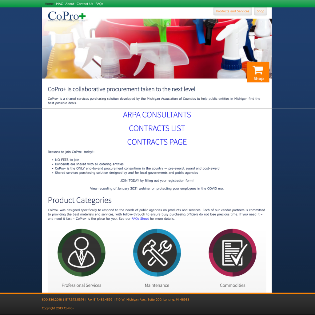
We’ve held off on showing you the original up until this point, because you know we love that wow factor. So, without further ado, here’s what we came up with:
The Old
The New
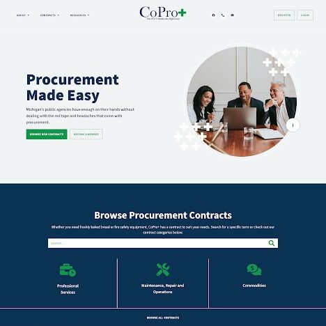
The new home page includes a search bar so members can look up exactly what they want right from the get go. It also has a bunch of useful links to benefits, information about the program, and even options to search by category.
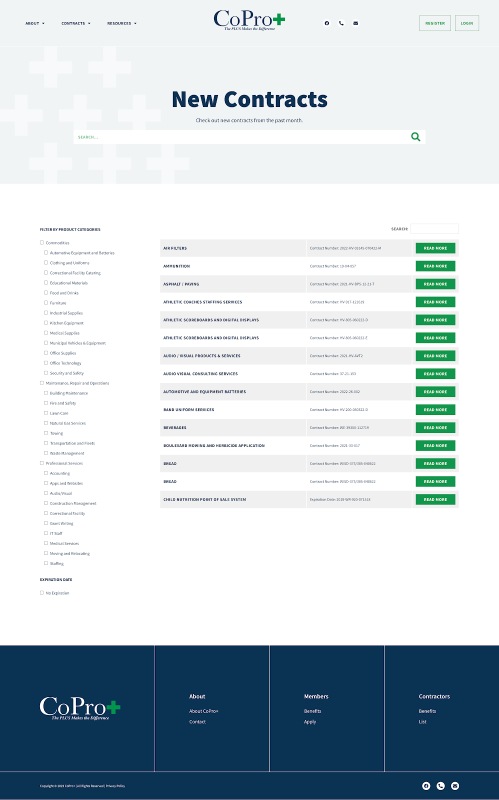
Oh, and while we’re at it, here’s an example of one of those contract lists. This page pulls in all of the newest contracts, along with what they’re for, what the number is, and it even allows members to filter by a specific category. Pretty cool, huh?
In the end, our client was SUPER excited about how the site wound up. They also loved that the contracts were so easy to edit on the back end, so they didn’t have to spend hours importing new contracts. Oh, and we also set the contracts to automatically expire after their expiration date, so our client didn’t even need to worry about something staying around after it wasn’t useful anymore. We’re all about making things easy.
Effective? Check. Easy to use? Check. Looks super good? Check! We’d be lying if we said we weren’t pretty damn proud of how this one turned out.

