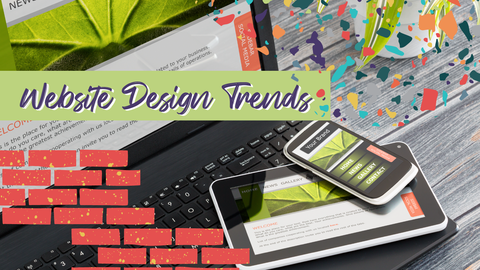
Are you sick of us talking about websites? Yeah, us too. This time we’re shaking it up and discussing cool design trends you’ll want to incorporate into your site.
Read on for the latest website design trends.
Variable Imagery
Okay, so this one might not count as a design trend, but we want to mention it anyway because it’s really damn important. This is something that’s been around for a while, but we haven’t seen many smaller brands utilizing it, which is a shame. It’s super powerful.
Essentially, variable imagery and variable content are sections of a website that are designed to switch out depending on who’s viewing the page. What do we mean? Well, if someone fits a certain user persona, like a dog lover, they’ll see a page with a photo of a dog. If they like wine, it’ll be a photo of wine. You get the idea.
When this is combined with services, products, and existing user personas, it can be really powerful. Did someone buy a couch? Show them a chair that matches. It’s like a subliminal way of upselling, and to be frank, we’re all about it.
Retro Vibes
No matter where you look, it seems the 90s, 80s, and 70s are making a comeback. Clothes, graphic design, logos…they all look like they stepped out of a Back to the Future Movie. Don’t get us wrong. We’re all for it, and that’s why we love seeing it on the web.
Obviously, the internet wasn’t really a thing in the 70-80s, but that won’t stop us from pretending like it was. Bright colors, script font, comic book shading…all of it can make a website look unique and up-to-date…even if the ideas are borrowed from a few decades ago.
Take the Memphis design, for example. With the rise of minimalist web designs came a slew of uniform layouts. While functional, it’s increasingly difficult to distinguish a website with this approach. Quick fix? Toss in a plethora of shapes, bright colors, and squiggly lines. Depending on how you use it, this style can achieve anything from playful to professional.
One-page Websites
Sometimes simple is better. There is an increasing popularity of one-page websites that forgo menus and navigation. Think of the site as a flier with who you are, what you do, and how to contact you. And all that information fits in one H1 title and paragraphs. They also have links to social media. There they can show more about the company than the website can. These sites are best for clients with little information or portfolios.
Big-Ass Typographic Images
Our digital attention spans are small—and they’re only getting smaller. While a well-framed image or illustrated graphic can pack a serious punch, sometimes it’s easier (and quicker) to let a bold and simple typographic image do the talking…literally.
Think of it as a news headline, but way more fun. Let your designer run wild with it—manipulate the typeface, rearrange spacing, play with different treatments and fonts. A well-designed typographic image, while elementary, is an audacious and effective way to get your brand story across in more ways than one.
When done correctly, this technique can leave a lasting impression on your audience. Use it wisely!
Animations and Interactive Interfaces
Ever since the smartphone became a day-to-day necessity, endlessly scrolling has become ingrained into the fiber of our beings. Okay, that’s a bit dramatic, but you get the point—we are scrolling A LOT.
It’s become a mundane and boring requirement for perusing the digital landscape. However, some designers are taking this virtual exigency and turning it into something playful, fun, and artful.
Parallax scrolling websites are starting to pop up all over the place—and we’re here for it. Webflow uses this design to take users through the history of the internet, fully equipped with designs and UIs of the past.
Some have taken it even further, such as Species in Pieces. A site dedicated to raising awareness about endangered species, the experience revolves around 30 separate shapes (pieces) that rearrange into different animals as you scroll through.
Keep in mind these trends are all well and good but if it sacrifices user experience it’s a no-go. Holler at us if you want more info on how to make these trends work for you, or you could just stop by with booze.


One Response
Your website looks beautiful according to other users and the expression of your services on your website is most important to tell your customers. This is a direct approach to connecting with your users or new clients and it’s a must to keep your website design changed after some time, not the proper way but some things that have been old. You have written an outstanding blog on website design trends, I like it and I appreciate your writing skills. It’s such a great article, users need this type of fresh content.