Mood boards serve as a bridge between concepts and the creation of a brand.
They are your design process roadmap, if you will. They identify images, fonts, patterns, textures and colors before you begin developing the actual brand.
Picture this, a client wants a vintage, retro feel for their new coffee shop and bakery. It’s our job to translate what they are describing into visuals. However, every person defines things differently, when they say retro are they referring to a certain decade? The 80s are very different than the 50s, so this is where a mood board comes in.
By asking a series of questions, which we do in a brand survey, we can get more direction on the desired “mood” the client wants. Then we develop a few different mood boards to illustrate design direction.
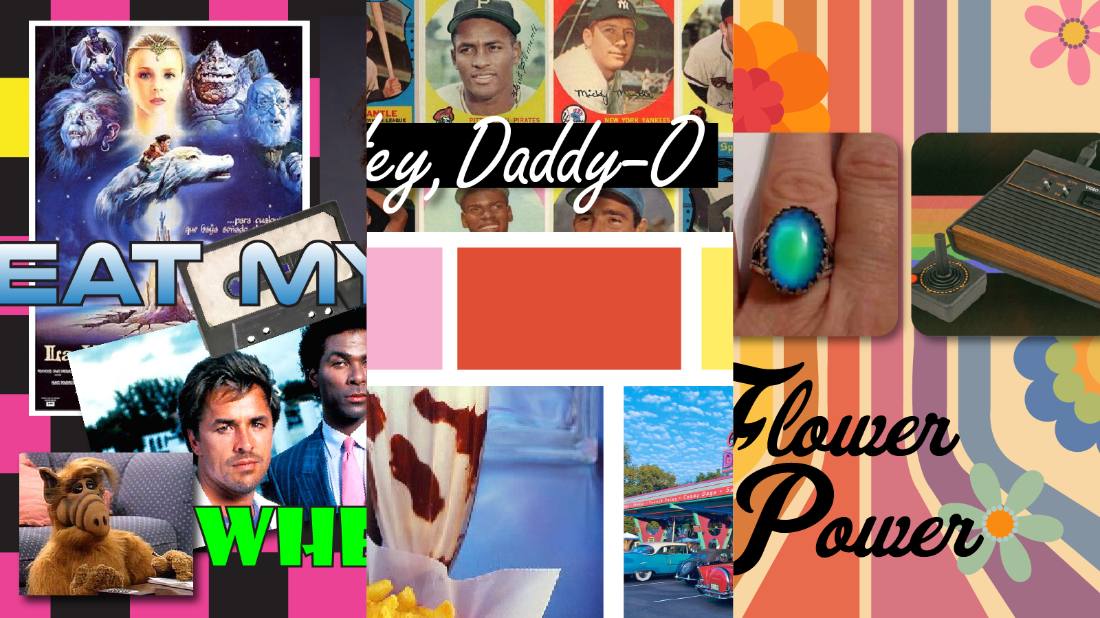
Here are a few examples.
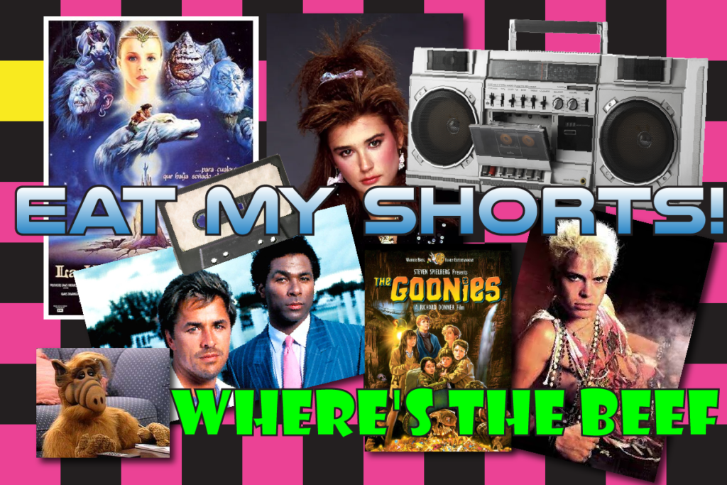
An 80s Throwback
If you need a refresher on the 80s, just watch Stranger Things. The show perfectly captures the entire decade with the vibrant colors, hairstyles, music, and fashion. Plus it’s like the best show ever. Like seriously. We love you Eddie Munson.
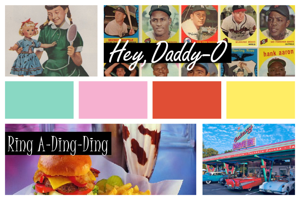
Clean & Wholesome 50s
Girls collected dolls and stuffed animals, while boys amassed shoeboxes filled with baseball cards. When they became adolescents, they bought records; sipped malts and downed hamburgers at the local ice cream parlor, or went to the local drive-in theater.
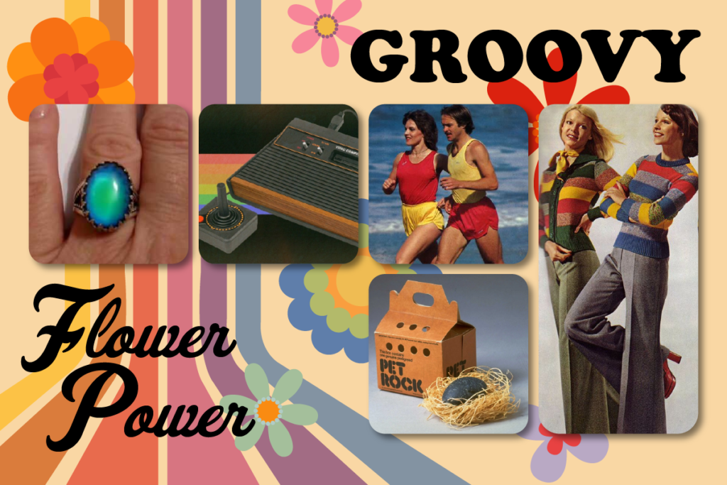
The Groovy 70s
The 1970s was in many ways a decade of fads and crazes. Whether in fashion (with bell-bottoms, hot pants, and mood rings), exercise (jogging, aerobics), play (pet rocks, video games), or dance (disco).
Mood boards act as a source of inspiration, ensures everyone is on the same page, drives future brand-related design projects, and tells a visual story about your brand.
They’re an incredibly important part of the branding process.

