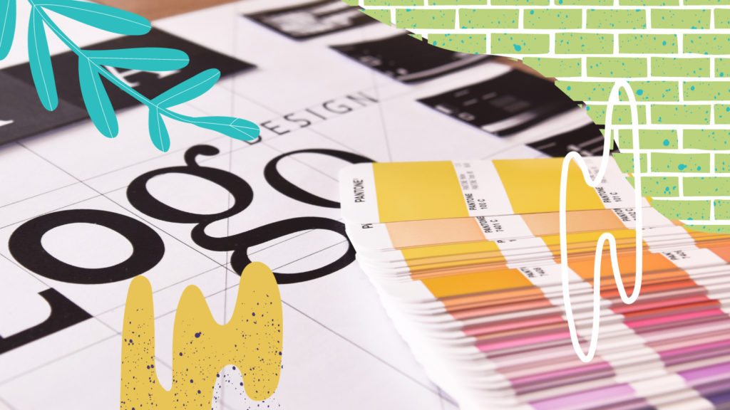
Here’s a little trivia to start off your Wednesday. The term “brand” originated in the wild, wild west to refer to the mark that cattle ranchers “branded” on their cattle. It’s evolved to now encompass much more than just a name or a symbol.
We’ve written a lot, and we mean a lot on branding. You can read about it here, here or here. We figured it’d be fun to chat about the different types of logos—wordmark, lettermark and brandmark. Basically just throw ‘mark’ at the end of any word, and you can make up your own logo type…kidding. You’d think creatives could come up with better names for this type of stuff. We digress.
Wordmark
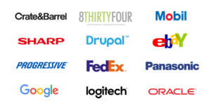
A wordmark logo is made up of text (typically the brand or business name) in a specific font. The text could be designed using a custom font or a tweaked familiar font. A wordmark is good for a client who wants to clearly explain what they offer, with only the use of their name vs. a creative element.
Think Disney and Google to name a couple.
Do: Play around with color.
Don’t: Overcomplicate.
Lettermark
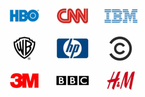
A lettermark logo uses text to create a unique typographic mark. This is useful for brands whose names have transformed into acronyms. Just a note here: please avoid acronyms. No one has time to guess what the hell your name stands for.
Do: Keep it simple.
Don’t: Forget the whitespace.
Brandmark
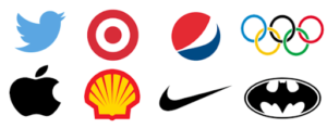
A brandmark logo uses an icon or symbol with or without the company or brand name. Brandmark logos are popular because images are often more memorable than words or letters. They also add more context to what the business offers, especially when paired with a wordmark.
Do: Spend time choosing/creating a meaningful, insightful and easy to understand icon.
Don’t: Choose a brandmark if you are a new venture. You’re not Apple.
Combination
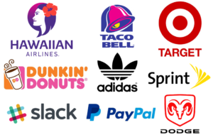
We often will combine one or two of the main types of logo designs at 8THIRTYFOUR. The trick to successfully combining these methods is to ensure that the logo is not cluttered and that every element included is meaningful, intentional, and helpful to explain the brand.
Do: Go this route. You can always utilize your icon separately once your brand is more established.
Don’t: Try this at home. Hire a professional.
Did you know? The human brain processes images 60,000 times faster than text, and 90% of the information we absorb each day is taken from the things that we see. It’s why organizations invest so much into logo design and hire agencies like 8THIRTYFOUR to ensure a full brand strategy and research is completed prior to the design.
Here’s a few of our branding case studies.
Cool, right? So what are you waiting for? Contact us right now.


